

In this tutorial:
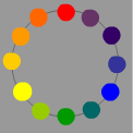
- Color wheel.
Why do we need to use it? - Color schemes.
What color combinations work best together? - How to use color to emphasize an element?
- What color schemes work best for backgrounds?
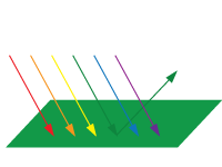
Color is the way we see light reflected from a surface or refracted through a prism.
Colors that we see in nature are reflections of light on the surfaces around us.
For example: a green surface absorbs all visible light except green.
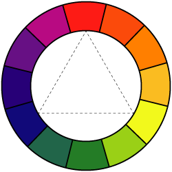
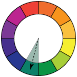
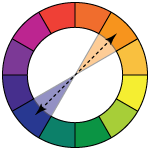
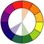
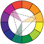
All colors are arranged in a spectrum. This arrangement is called Color Wheel.
We use Color Wheel as a reference for color mixing and choosing color schemes.
Position of each color is defined by the colors next to it.
There are three primary colors:
Red
Yellow
Blue
These colors make up the rest of the colors in the Color Wheel.
These colors cannot be made by mixing any other colors.
These colors are spread out evenly in the color wheel.
Secondary colors can be created by mixing primary colors.
Secondary colors are:
Orange
Green
Purple

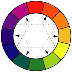
These are the colors that you get by mixing a primary and a secondary colors.
For example:

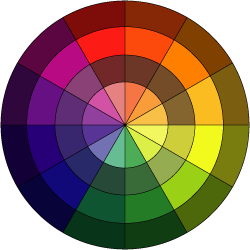
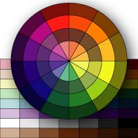
Color wheel include all value variations of colors (shades, tones, and tints)
More information about Color Theory you can find in the presentation below. It also includes information about color values, how to mix colors, how to create Brown color, etc.
presentation
Color wheel
Color schemes
Color scheme is a set of colors (color combination) that is used in a design or an artwork to achieve certain goals. Color schemes are used to create style, appeal, and an aesthetic feeling.

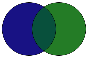
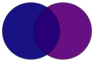
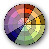
monochromatic - variations (shades and tones) of just one color
Works great for backgrounds, for creating depth in the picture, etc.

If one color is so dominant that it overpowers small areas of other colors - it is still considered a monochromatic.
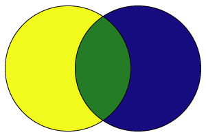
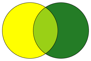
analogous - variations of 3-4 similar colors - colors that are next to each other in the color wheel
Also, good for backdrops, the areas that do not need a strong contrast.
If you want to add a contrast to that color scheme - use value contrast (light/dark).
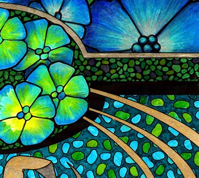
Analogous colors can be very vibrant and colorful, but at the same time they so fit together.

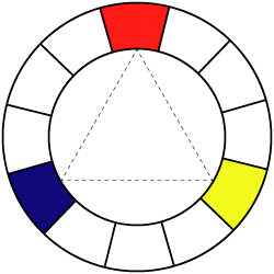
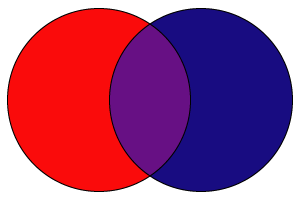
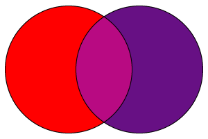
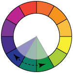
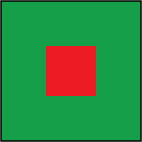
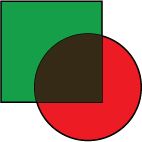
complementary - variations of the opposite colors
That's the color scheme you want to use if you need to create a biggest color contrast possible. Complementary colors, when placed next to each other, both look their brightest.
That also applied to their dark and light variations.
You can achieve different effects by choosing different color schemes for your design.
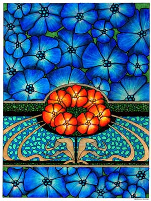
For example:Complementary color scheme is a unique one - there is a trick with complementary colors that you need to know:


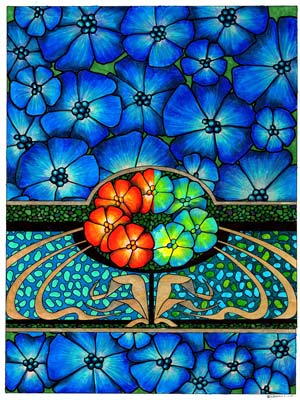
Compare left and right sides:
Orange flowers on the left are complementary to blue background - that makes them stand out and be the focus of the design.
Yellow-blue-green flowers on the right are analogous colors - they do not create much drama or contrast.
Knowing complimentary colors is helpful when you want to emphasize something or create a contrast.
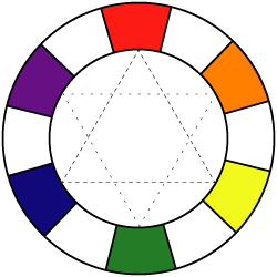
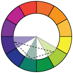
There are also variations of this scheme, like split complementary color scheme - where instead of using a direct opposite color, you can use the two colors right next to it.
This design is based on three colors:
blue
green
orange
Which makes it a perfect example of a split complementary color scheme.
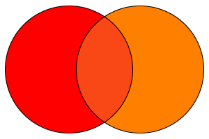
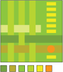
triadic (split 1) - variations of any 3 colors that are separated by one color in the color wheel

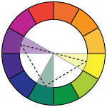
triadic (split 2) - variations of any 3 colors that are separated by two colors in the color wheel

triadic (split 3) - variations of any 3 colors that are evenly spaced in the color wheel

If the colors are similar in tones - triadic color scheme can be quite settled and colorful enough to create interest.
If the colors are more pure and bright - you can create a lot of drama with it.