julianna kunstler logo
adding depth

to your coloring project
Instagram icon
 
How to add depth to your coloring project

In this tutorial:

How the light works?

What is Chiaroscuro?

How to shade simple forms?

How to shade with color?

How to use contrast?


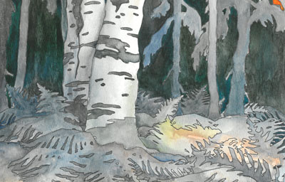
The key to adding a depth to your coloring project is a simple logic. You need to know:

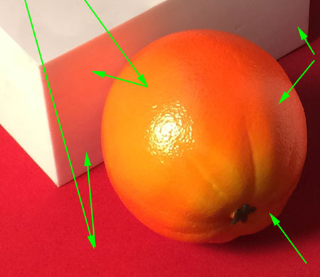
1. Where is the light sourse? You can just answer a simple question: "Is the light coming from the right or left, top or bottom?". If it helps - put a dot (with a pencil) on the corresponding spot of your coloring page to represent a light sourse.

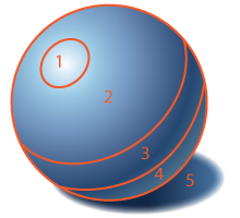
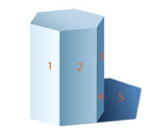
2. What is light and what is dark? The part of a shape that the light falls onto of the object you’re coloring (or shading) should be the lightest, and the shape should get progressively darker the further from the light source you go.

3. Shadows. Drop shadows are darker than shaded parts of an object.

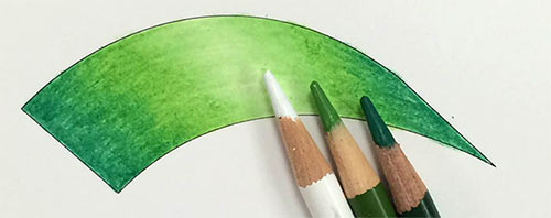
4. How to blend colors when shading? Use any of the coloring links above to lern about mixing and blending colors.

5. Black and white colors. White and black should not be overused in color shading. Use black only at the darkest areas, and even there - mix it with other colors (blue and purple work great for shadows). Use pure white for light reflections, otherwise mix it with colors. Sometimes you can leave your background white, but only if it is justified by your project.

how the light works

To color a shape with a three-dimensional effect - you need to understand how light reflects off a surface of an object, and then follow a simple four-step coloring technique.

When light hits an object, it bounces off it - this is how we see colors, the light also bounces off the surrounding objects and reflects off all surfaces.

Think about how light is reflected from a surface that is facing a light source, making that area appear lighter. Usually these areas are the highest or most prominent. Areas that are further away from the light source are darker. Determining where a light source is enables you to know where to add shading.

Chiaroscuro effect

Chiaroscuro breaks the distribution of light and shade in a picture into a pattern. If you follow the pattern - your drawings will look three-dimensional. The same pattern applies to simple geometroc forms (below) and to complex organic dorms in tature.

  1. Highlight is the lightest area of an object. This is where direct light hits the surface.
  2. Light - as the surface curves, it does not get as much light, so value becomes slightly darker.
  3. Shadow - once the surface curves away from the light source, it does not receive any direct light, but it does get some indirect light from the surroundings - that's why it is not completely black.
  4. Reflected light is light that is bounced off the surfaces (surroundings), making the value slightly lighter.
  5. Cast shadow is the darkest value, but further it is from the object - lighter it gets.


sphere:

oval/crescent shaped pattern

cylinder:

rectangular shaped pattern

cone:

triangular shaped pattern

Use chiaroscuro shading pattern when coloring. It can be applied to any form.

When you shade (color) objects that are not placed into any surrounding space (illustration of a flower, design, etc) - you can skip the reflected light area as there are no surface to bounce the light off, there will not be a drop shadow either for the same reason. But you definitely need to have the main three: highlight, light, shadow.

shading

When you shade a cube, a prism, or a pyramid:

highlight (1) gets direct light and is lightest at the area of biggest contrast;

light (2) gets light "at an angle";

shadow (3) does not get any light and is the darkest next to the area of biggest contrast;

reflected light (4) gets bounced light;

drop shadow (5) is the darkest next to the object.

Any complex form can be broken down into basic shapes. Once you understand the technique, you can apply the steps to any part of your design.

color shading

Each color has its dark and light variations. Use these variations to shape the object that you are coloring.

Same rule applies to colored pencils - you can add volume to any shape that you are coloring!

More information is here.

contrast

two color schemes coloring

Contrast is a powerful tool you have. You can manipulate the appearance of objects by increasing the contrast (bringing them close to the foreground) or fading the conrast (and placing them into the background as non-important).

See how a slight change in color temperature creates a focus center....

Contrast can be in color (complementary colors), value (dark/light), texture (smooth/rough), strokes, details, etc.

...