tips
color chart
Make a color chart of your pencils before you start, especially if these are new pencils... Very often the colors look slightly different on the outside.
Use any of the charts below.
Coloring a flower
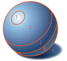
Coloring a flower is not much more difficult that coloring a simple shape - the same rules are applied to each petal's surface: there are highlights, light areas, and shadows. There are also possible drop shadows from other petals!
Start with deciding on the main color. Then select colored pencils that you need to color the flower. Keep them as a group if you need to color multiple flowers in the design.

What I chose here (left to right):
Dark Brown and Indigo Blue - they are great for shadows
Dark Green - to add some green undertone to the areas, that are close to the stem
Dark Peach - for all mid-tones and shadows. Also works as a blender for the first three colors
Red - to add extra color to the edges of the petals
Light Peach - main color
Cream - for highlights

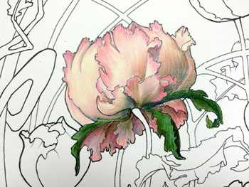
I'll focus on a simple shaped bud.
Place a piece of paper over the drawing so that you don't smudge it as you move your hand while coloring.

Place the highlights lightly.

Then focus on one petal at a time.
Shade lightly the light areas with the main color.
Overlap the two colors for better blending later.

Shade the darker areas (in this case it's the bottom of the petal)

Next, I added the red edges.
Still very lightly shading, may be a little more intense close to the very edge.

Blending time!
I used the main color to blend all areas except the highlights.
Blend the highlight into the rest of the petal with the lightest pencil (in this case it is Cream)