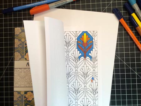
1. Choosing the right tools
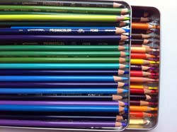
colored pencils
Choose good ones! Look for a professional grade.
Quality pencils are easy to blend and mix. The colors are more vibrant, and there are more color choices.
Important factor when choosing colored pencils is the price.
Good pencils are expensive, but once you try quality pencils, you'll never go back to cheaper ones (sorry, Crayola...)
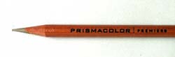
I like Prismacolor Premier (soft pencils, rich vibrant colors, great for mixing colors and blending) or Verathin (harder pencils, not as intense color, great for coloring small details).
Start with buying the smallest set and see if you like working with the pencils, then you can buy more colors.
And, please, keep them sharp!!!
Also, think of getting some extras, like a blending pencil - a colorless pencil that is used to blend the strokes.
colored pencils basics
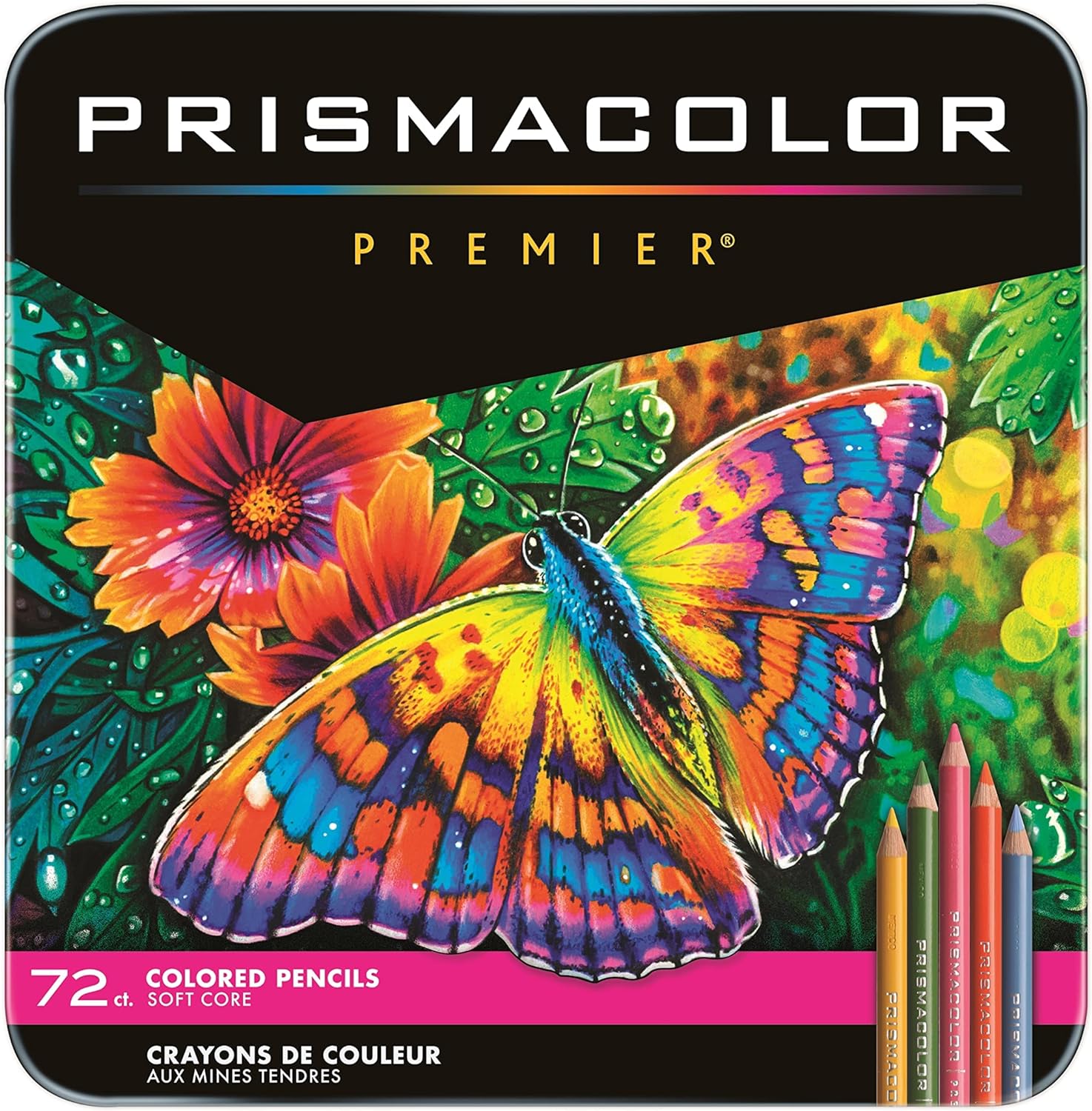
Prismacolor premier 72

Prismacolor premier 24
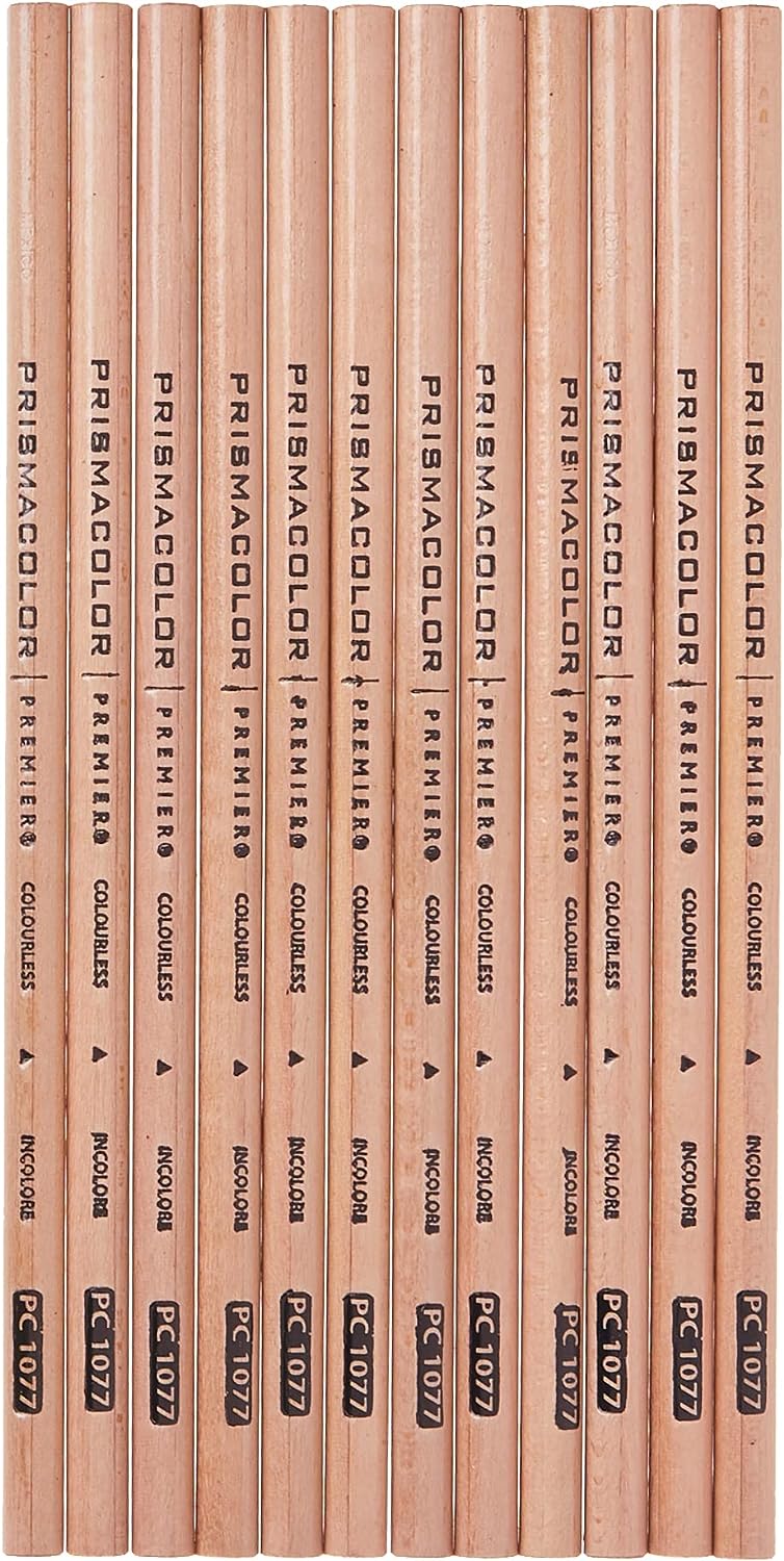
pencil blender 12
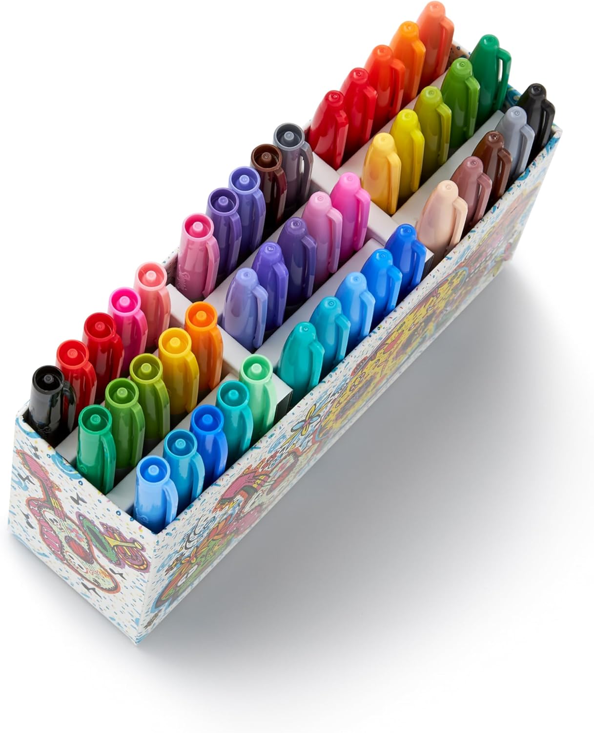
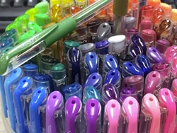
markers

You might need a few different sets of markers for your coloring needs. There are many types of marker sets out there: water-based, alcohol-based, and solvent-based; they have different tips, and serve different purposes.
You will probably would want to experiment with them. A good starting point is to go to an art supply store - they often have one sample there for you to try.
The markers come in different color palettes - bright colors, basic colors, neutral colors, metallics, etc. Some markers tend to "bleed" through the paper - so before coloring in a book - try them on a scrap paper.
markers and pens basics
color markers

alcohol-based markers
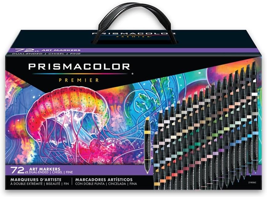
Prismacolor markers

oil-based markers

paint markers
pens
Pens come in different types and colors. They work great for detailed work and decorative effect. I like to use them as an add-on to other media.
Make your own color guide - the ink usually looks different from what it appears on the pen cap.
Do not overuse gel pens with glitter.
I like to use metallic jell pens - they are a great alternative to metallic markers, that tend to bleed through paper.
markers and pens basics
watercolors
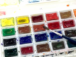
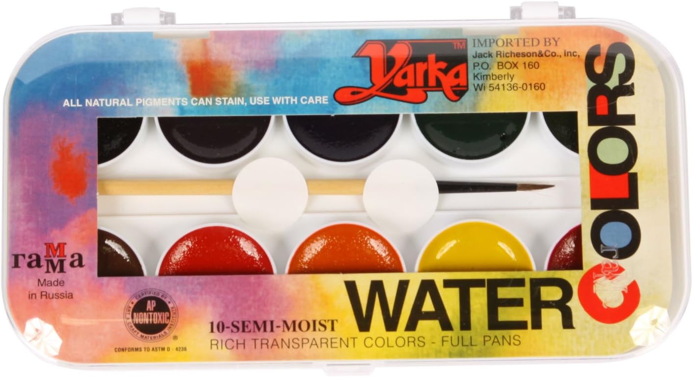
Select a set of watercolor paints. A 12-color set is a great starting point. Most sets have a good selection of basic colors you’ll need for transparent watercolor painting. Rarely (or never) use the white paint that is included in most cake or tube color sets. It’s opaque. It will make your watercolors loose their transparency, which is the quality you use watercolors to start with.
Start by using “academic” or “student” grade watercolors until you feel like it is time to move on to “artist” grade watercolor supplies.
My personal favorite brands are "Yarka" or "St.Petersburg". These are Russian brands, but they are available here in art supply stores and Amazon. The paints come in different sets at different prices. They still use traditional pigments, the colors are vibrant and just an joy to work with.
watercolors basics

professional set 36

watercolors 12
watercolors 10
acrylics
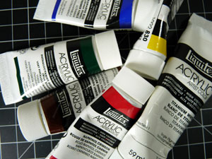
Buying acrylic paint when you're a beginner can seem as a difficult task - there are so many different brands, colors, and variations to choose from...
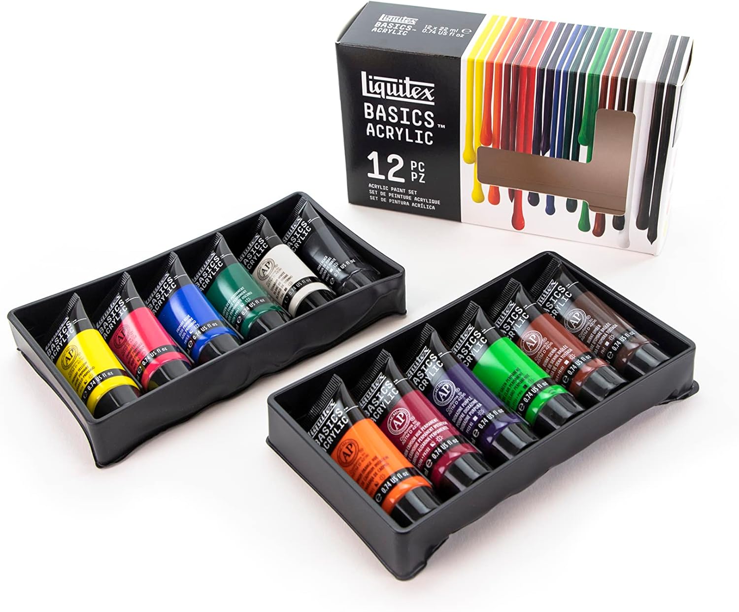
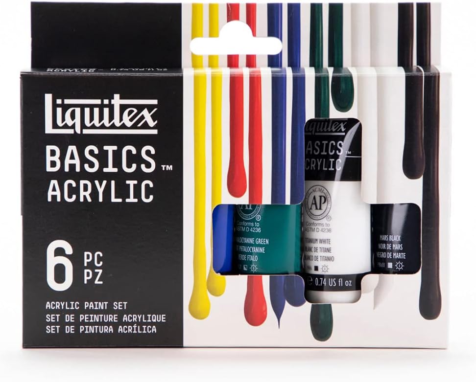
What you need to remember, is that you need to have at least 5 colors: Blue, Red, Yellow, White, and Black. You can mix any other color just by mixing these paints in different proportions.
Like with watercolors, choose a "student" grade paint set first. Then, gradually move to "professional" quality paints - they are more expensive for a reason. Professional paints do not fade as easy over time, they have more color choices, etc.
acrylics basics
acrylics 12
acrylics 6

drying retarder
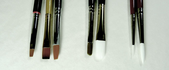
brushes
First of all, choosing a brush depends on the media you are going to use.
There are different brushes for watercolors and acrylics. There are many brush guides out there, but here are some suggestions if you are just starting:
watercolor brushes

These brushes have the ability to hold water (and paint) by having a fatter belly and thinner hair.
Round brushes: Their shape makes them suitable for small details and delicate lines, but also for broader strokes and washes. Round brushes are my choice foe washes and long, continuous strokes.
Good brushes are made of a high quality hair, like Kolinsky sable, it will be best put to use in the form of a round brush. If you find sable too expensive, try a synthetic or combination round brush.
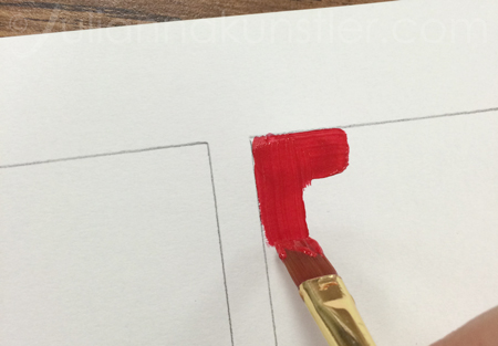
Flat brushes (also known as "one-strokes") aren't as versatile as round brushes, but they're useful for both washes and strong linear strokes. They're available in sable but for most artists it's fine to save money by going with another natural hair or synthetic fiber. Flat brushes are my first choice for "coloring inside the lines" - they make nice, sharp edges.
Also consider getting detail brushes.
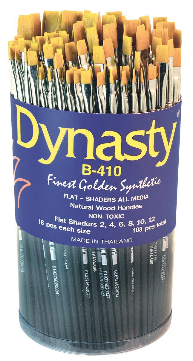
flat brushes
flat brushes
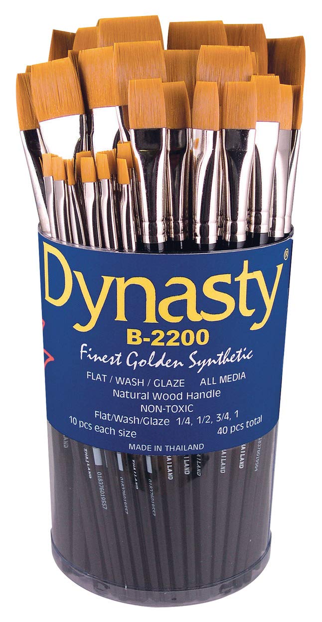
flat brushes
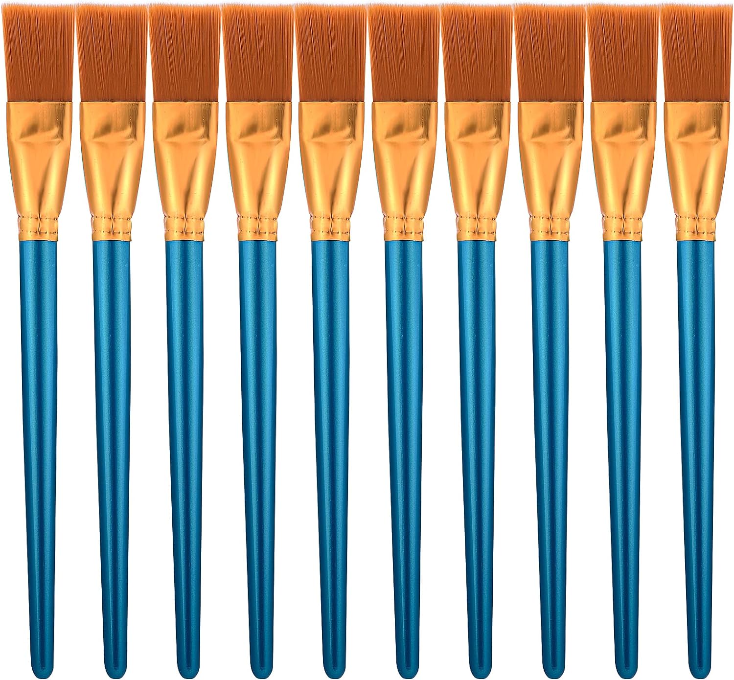
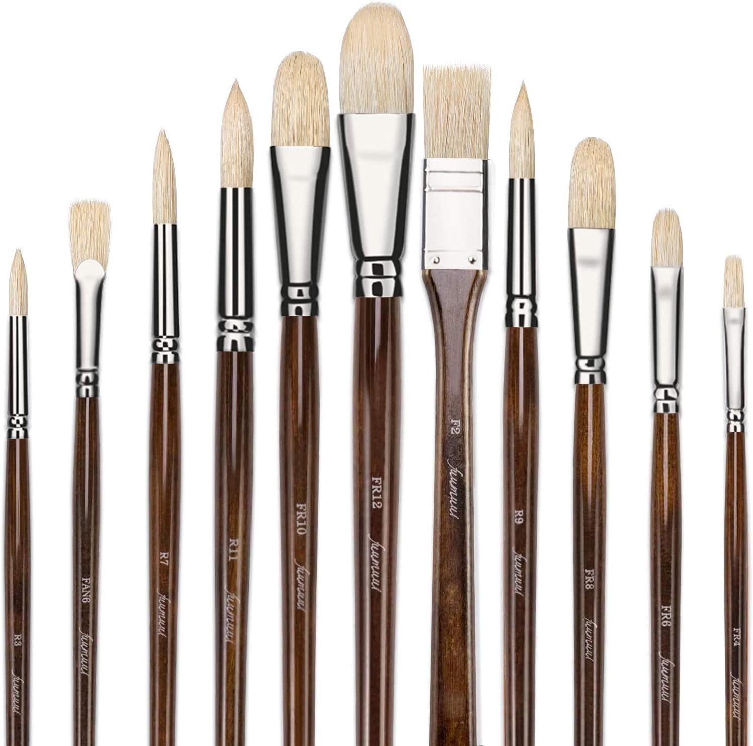
acrylics brushes
Brushes, that are used to paint with acrylics (or oils) are made of thicker hair, the bristles are more firm. The task that they have to perform is not to hold water, but to hold a thicker paint. Can use natural or synthetic hair.
Flat brushes are still my choice for coloring in. They make a good job filling spaces, edging the outlines, etc.
Filbert brushes - are a combination of flat and round brushes. They have round edges and are great for blending.
Round brushes - use for outlining, detailed work, filling in small areas, long thin-to-thick-to-thin strokes.
flat brushes

round brushes
oil brushes
2. Where to start?

Your starting point depends on the particular image and your coloring approach.
Here are some thoughts::
1. If you are coloring a design with mostly solid colors, that is purely decorative and does not require extra shading techniques - you can start at any area that appeals to you. I like to start with a background color, but that is not always the case.
After all, this type of coloring is purely therapeutic - so go ahead and break all the rules!
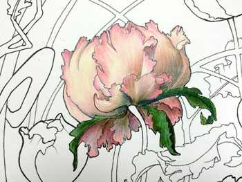
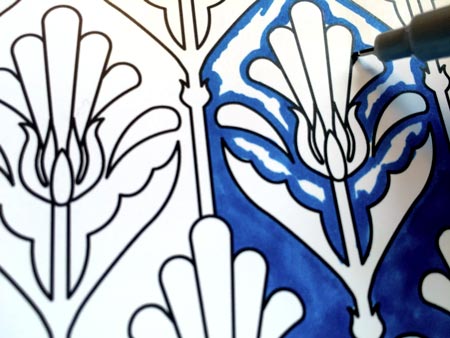
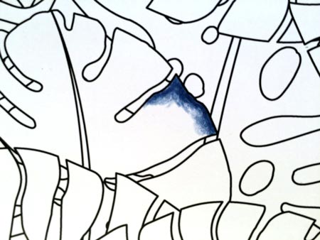
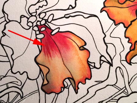
2. If you are working on a more advanced coloring project that requires more complex coloring and shading techniques, like realistic shading,
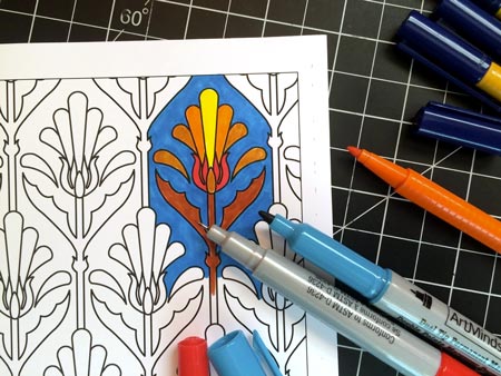
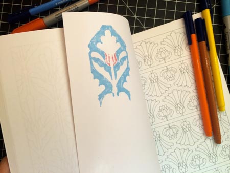
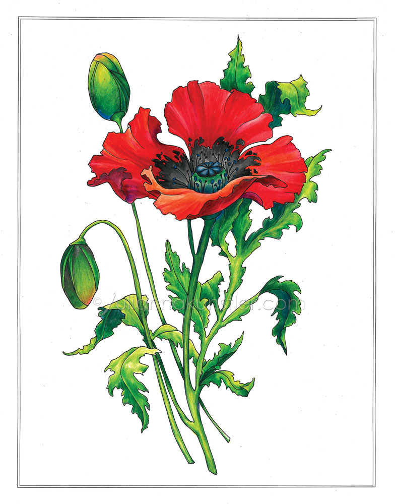
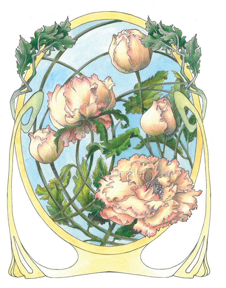
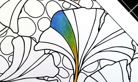
I would start with one of the elements that are a focal point of the composition, or positioned in the central part of the design. If you are afraid to start with more challenging element - start with a part of it, that is not as intimidating. Like in this example - you can start with a leaf instead of the whole flower.
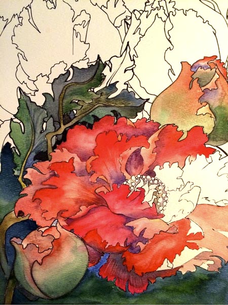
Starting with a background might be the easiest part to start with, but keep in mind that the colors of the design should work with the background colors.
So I would wait until my design is done, and then work on choosing the right color for the background...
or
...you can work on the elements and the background at the same time, especially, if there is little of the background and the colors work together.
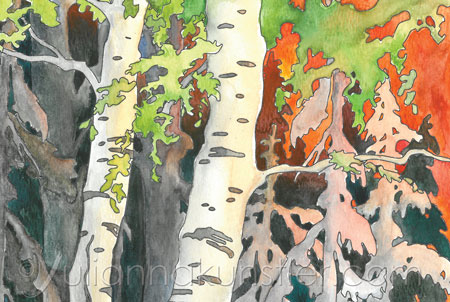
3. If you decide to color a scenery or a landscape - start with the sky or the foreground. Why?
Sky will set the mood and the color scheme for the rest of the drawing.
Foreground will set the tonal value of the drawing, especially if you want to achieve a contrast between light and shadows.
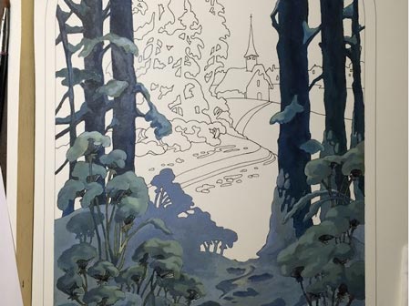
3. Working with colors
Be easy on the backgrounds. Remember - they are here to support your main elements, not to distract from them. So don't make your design compete for attention with the background. That means - if your background has a lot of details - might be a good idea to color them in similar colors....
Color is the most emotional element of art.
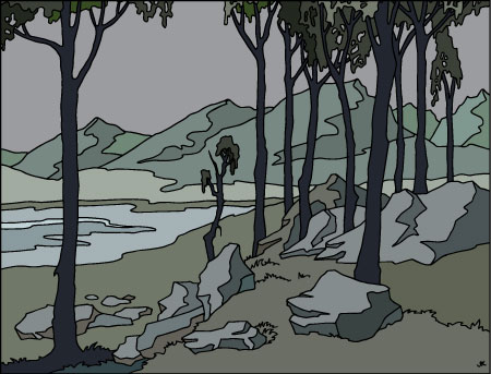
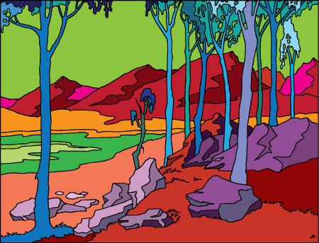
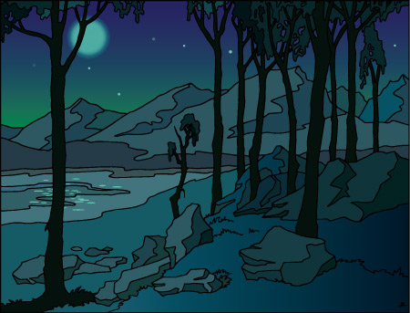
Compare the three images - the only difference between these images is the choice of colors.
Selecting colors and color schemes can literally affect your mood.
Cool colors like blue, green and purple have a calming effect. Use them to literally chill out.
Warm colors like red, orange and yellow are pepper-uppers. Try them when you want to brighten a bad mood.
Bright colors are energizing, so turn to them when you want a little inner lift.
Dark colors carry a relaxing energy and can be used to ratchet down an overactive mind.
Pastels and light tints communicate softness and help soothe the soul.
Read more about colors here.
trying colors
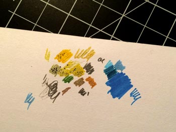
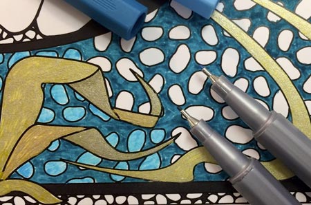
Always have a piece of scrap paper available when coloring.
Very often the actual color of a pen, marker or pencil does not exactly match the color it produces. It might be lighter, darker, or brighter than you expect it to be.
Use the same scrap paper to see how the colors work together before you use them in your design.
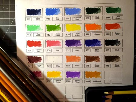
Another good idea is to make yourself a color chart of the materials that you use.
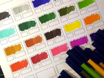
Try layering the colors in your chart - to see hat it looks like when you apply multiple layers of the color. This will make a difference when you use markers and watercolors.
Note: some materials change colors when dry - acrylics become darker, watercolors and tempera - get a bit lighter.
4. Shading, blending, mixing
When shading, especially with colored pencils, always use small strokes - they are easier to control.
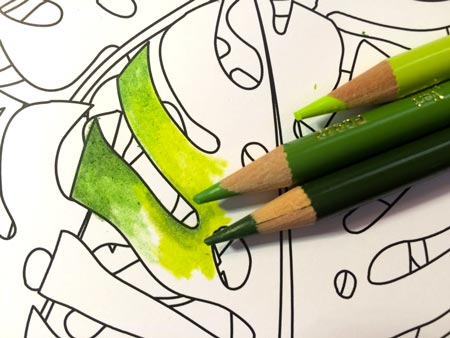
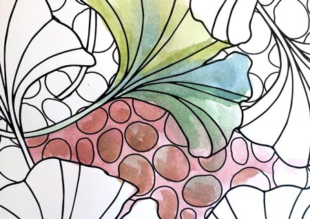
To add an interest to your design - try to blend 2 or 3 colors inside each area (shape). It does not necessarily have to be a dimensional shading, but it will make design look more decorative.
This technique works better with colored pencils and paints. You can try it with markers or even gel pens, but experiment with them first.
Try the color combinations on a scrap paper.
Get the right tools for blending - there are colorless pencils and markers out there, that specifically designed for blending. When working with colored pencils, use the lighter color as a blender.
Also consider other techniques - like using baby oil to blend colored pencils, or use watercolor colored pencils.
5. Staying inside the lines
Do we really need to stay inside the lines?
Depends on your goals.
If you want to develop skills, to exercise eye-hand coordination, to calm down then - yes.
From artistic point of view - not necessary. This can add some liveliness to the design.
Especially, if you are working with a transparent medium, like watercolors.