julianna kunstler logo
zen landscape

creative patterns
Instagram icon

by JuliannaKunstler.com

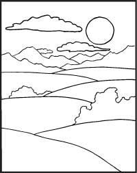
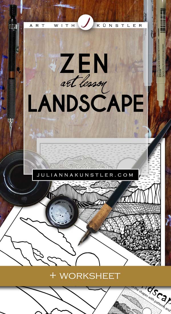
We are going to apply some patterns onto this simple landscape template.
First of all…. Why are we doing it? What is exactly the purpose of this exercise?
Well, the first reason is obvious - working with patterns and repetition principle.
In spite of it sounding simple, there is a process and steps that need to be learned while doing that.
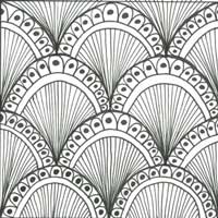
The patterns we are going to work with are both grid-based and free-form.
We will also learn to work with pattern VALUES.
Each graphic element has its own VISUAL WEIGHT, that is based on both VALUE and intricacy of the design.
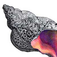
You will learn to manipulate and bend patterns to create an illusion of depth.
Working with intricate designs boosts your creativity, develops better eye-hand coordination, improves drawing skills.
And, of course, it is still very relaxing. No wonder this technique is called zen-patterns.

Learning objectives:

  • Repetition & pattern
  • Pattern value
  • Visual weight
  • Manipulate patterns to create an illusion of depth
  • Pen & Ink drawing skills
  • Creative thinking
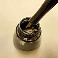
  • Note: Pen can be substituted with an extra-fine point black marker.

GALLERY

patterns

STEPS

template

Before we start drawing some patterns, we need to analyze the shapes that we are working with and create a plan.
First:
The depth of the picture. What we see is clearly a landscape with a foreground (at lest the 3 shapes), middle ground, and a far background.
Plus, we have the sun (or moon), a few clouds, and the sky itself.


How do we use value in aerial perspective?

Similar object tend to become smaller and lighter with distance, they are seen with less details

If we apply these principles here:

• Foreground patterns should be darker than similar elements in the background,
• They should be more intricate, detailed, to create interest
• Background design elements should be smaller.

What else we should consider?

Well, all shapes in this template are not quite the same - we see hills, bushes, mountains, clouds. Each of these shapes has its own texture, so let’s not forget about that!

One more thing to consider - patterns grids.
Each shape should not look too flat. Let’s add some 3-D quality to them.
We can do so by warping the pattern grid as if you cover the hills with a huge pattern
We can change the direction of the elements based on the need of the particular shape


Before we start drawing, have some sketches or pattern samples ready for a quick reference.
It does not mean you will have to copy them, but they can be a good starting point or just an inspiration.


Not all shapes will be filled in with grid-based patterns.
You decide which ones.

Use a pencil and very lightly sketch the grid lines.
Curve them to follow the form.

Deeper into the picture - closer the grid lines


Start with the patterns in the foreground as they are going to be more detailed and difficult.

Remember that you can include linear patterns and modify them to fit your plan.

Trees and bushes - I am using free form patterns to get the “feel” of some leave.

Mountain patterns are simple and mostly vertical - to create a visual contrast with the hills. The designs are more angular , virtually no curved elements - to show the rough rock texture.

Unlike clouds - that are supposed to be soft. You decide how light or dark you want them to be.

Would have the sun/moon the lightest value of all.
Actually, leaving it blank will create a focal point in the landscape.

helpful links:

pen and ink

Pen & ink basics

creative patterns

Creative patterns 1

creative patterns

Creative patterns 2

creative patterns

zen patterns

...