julianna kunstler logo
Principles of Design

infographics
Instagram icon

by JuliannaKunstler.com

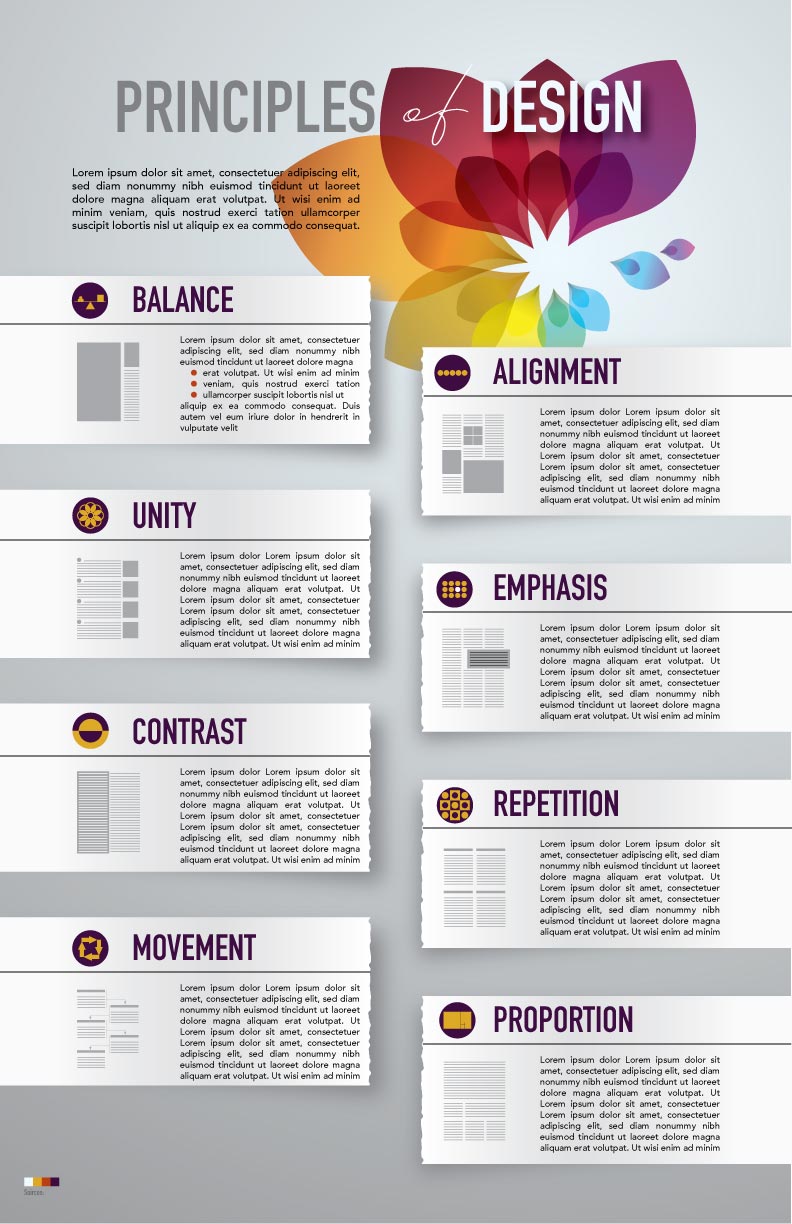
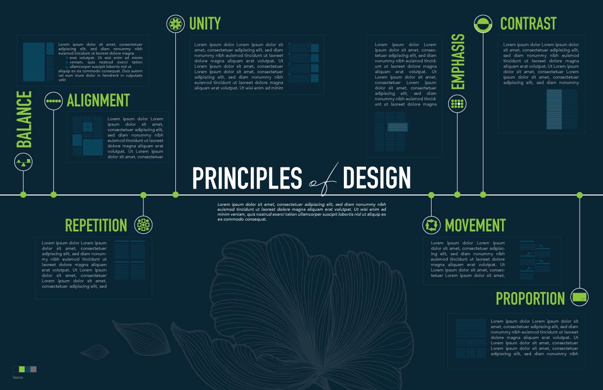
Utilize all Elements of Design to create Principles of Design infographic.

  • Use lines to separate, emphasize, group, or guide. Use any type or style of lines. Be consistent.
  • Use shapes (graphic elements, underlays, text blocks, image frames, etc.) to balance the layout, to emphasize, illustrate, and support a grid structure (alignments).
  • Use values for balance, hierarchy (e.g. headers vs. body text), and 3D effect (shadows, etc.).
  • Use a specific color scheme (3-4 colors).
  • Experiment with texture and typography - choose appropriate typefaces for all text areas (2-3 fonts).
  • Leave enough white space for user-friendly look. Experiment with depth and positive/negative space.

Other requirements:

  • Infographic should be informative! Correct spelling!!!
  • The design should be consistent - all graphics should be in the same style
  • There should be an easy flow from one topic to another
  • Balanced composition
  • Alignment!!!!!!
  • Content is informative
  • Easy to read and follow
  • Include sources (give credit!)

Start with choosing a type of infographic layout:
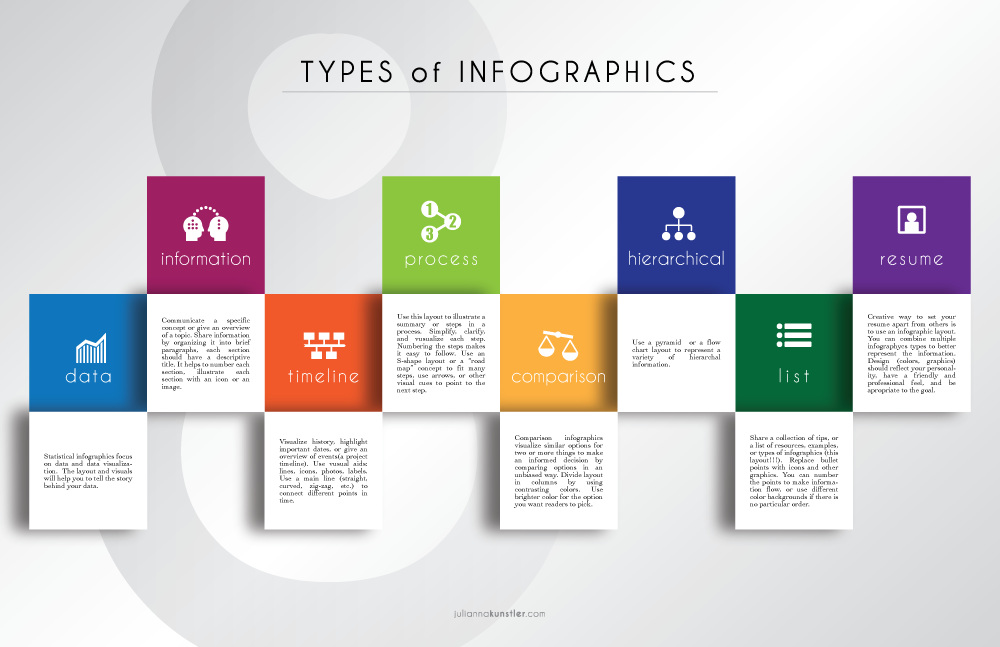
types of infographics

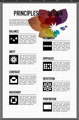
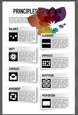
Principles of Design:

examples:

STEPS

Do a research.

Find and analyze information about each principle.

Create or find examples of how each principle is used in Graphic Design..

Sketch out the layout.

Explore infographics images for inspiration.

Create a new file in Adobe Illustrator:

11x17 or 17x11 inches - based on your layout.

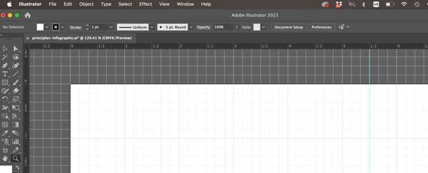
Preferences > Guides & Grid > Gridline: every 1 in. Subdivision: 6

(Remember: There are 6 picas in 1 inch)

Use grid and guides to designate areas for each topic.

View > Show Grid

View > Rulers > Show Rulers

View > Snap to Grid

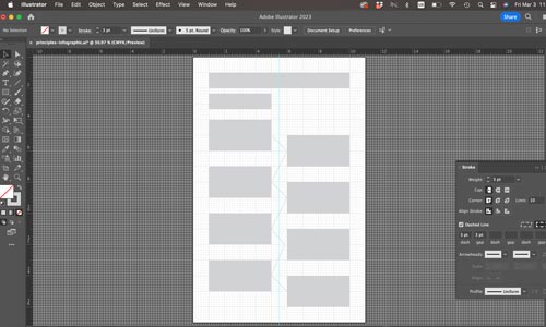
Drag a guide to divide the document in half.

Create a layout template to designate space for each element.

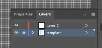
Lock the layer.

Create a new layer for your layout elements.

Add placeholder text areas.

Experiment with typography for both: headers and body.

Body text should be no more than size 11.

Start working on add-on graphics.

All graphics should be done in a same style and look consistent.

Experiment with additional graphics to emphasize each Principle of Design.

Use shapes or lines to group information of each Principle.

Hide the grid and the template layer to preview your progress.

Pick a color scheme.

Use this link to preview the colors.

Create 3-4 swatches to use.

(I used tetradic/rectangle color scheme).

Colors should not compete for attention or clash. Use different values and saturation settings.

Try changing colors of headers, graphics, background, and body text.

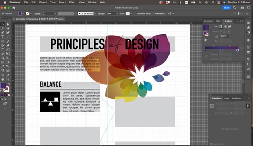
Consider using gradients.

Experiment with colors until you are happy with the way they look.

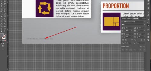
Do not forget to give credit to your information source.

All graphics should be using the same color scheme.

Continue experimenting with graphics.

Add visual examples of each Principle use, make icons for the principle.

Resize and place your color swatches next to the Credits line.

...