Step 2
Research information that you might use in this ad campaign or to make a cool poster. Think who is your target audience. Not all of this information will be used, but the more the better.
Explore what is already out there for a similar product/object.
Come up with text ideas you might want to use. Write them down before you forget.
step 3


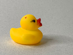
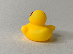
Open your "object" photos in Photoshop.
Fix any imperfections if needed.
Remove the background. (lesson here)
Save as PNG file with transparent background.
Poster 1 - Blurred background
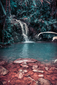
Almost any image can be used as a blurred background as long as it suits the vibe that you’re going for.

Find stock photos that give you the vibe and colors that would be appropriate for your poster. Calm or energetic, happy or sad, etc... Save a few. Think of how the photo colors would interact with your "object" color....
Open your background photos in Photoshop - one at a time.
Experiment with blur filters (Filter > Blur).
Save the image.
For example:

Filter > Blur > Gaussian Blur

Filter > Blur > Motion Blur

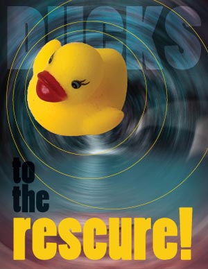
Filter > Blur > Radial Blur > Zoom

Filter > Blur > Radial Blur > Spin
step 5

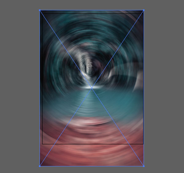
Create a new file in Illustrator.
8.5 x 11 inches
Drag the background file onto the art board.

The artboard will display the image, but it stays linked to the file itself.
That means if you make changes in your file - they will appear in your Illustrator artboard.
You will have to resize the photo to fit the artboard. Make sure you hold SHIFT to maintain the proportions.
Lock the layer.
step 6

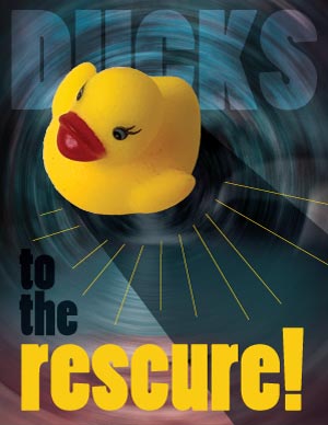
Add your object and the text. Be creative with typography.
Use colors that are already in the image, experiment with type placements, styles, maybe type on a path....
step 7
Decide if you need more graphics.
What is the message you are trying to communicate?
What is your focal point?
Experiment!!! This is the fun part!!


step 8
Export as a PNG or a JPG file

You can also consider blurring only a part of the background photograph.
That works great as an underlay for the text.
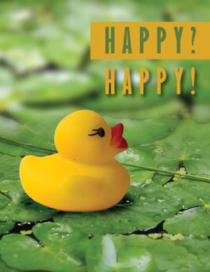
Poster 2 - Contrasts through images

- color contrast
- value contrast
- texture contrast
- size contrast
- conceptual contrast
- graphics type (photo vs. vector; realistic vs. solid color)
You can use a combination of raster and vector graphics.
Experiment with clipping masks and typography.
Consider multiple types of contrast (graphics type, color, value, etc)
Just make sure the text message supports the visual.
Poster 3 - Depth of Field
Depth of Field is the area in the photograph in which the image is razor sharp.
Everything within that area is in focus. You want your area of interest to fall into that area.
The areas behind it and in front of it are blurred.

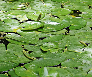
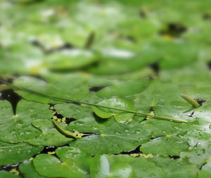
Compare the two images below.
See how you focus on a specific area in the second photograph?
This is what we are going to do next.


focal area

Choose a background photo with distinct foreground and background, that is in scale to the object.....
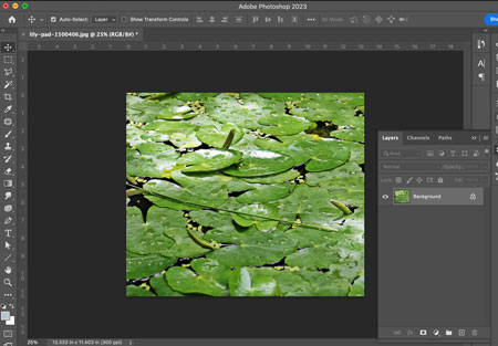
Open the photo in Photoshop.

Duplicate the layer.
You are going to apply a Blur filter to it.

Filter > Blur > Gaussian Blur
Adjust the setting.
...

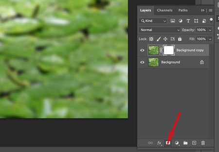
Add a Layer Mask to the layer.
Layer mask hides the areas in the layer that are painted black and reveals everything that is white.
Grey areas make the layer areas translucent based on how dark or light the grey is.

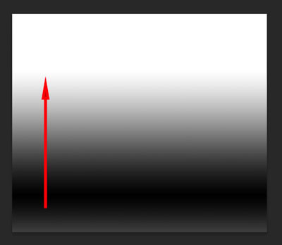
To make the transition smooth - you are going to draw a black-and-white gradient on the layer mask.
Select the Gradient tool from the Tools panel.

Choose "Reflected gradient" in the Options bar.

Click and drag the Gradient on the Layer mask.
You will not see the gradient itself, but you will see the result.

This is what it will look like if you hide the original background layer.
The mask hides the area that you want to be in focus.

And this is what it looks like when you have the original photo back on.
Shadow

Sometimes you need to add a shadow to your object to make it look more real.
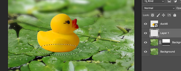
Create a new layer right below your object.
Use Elliptical Marquee tool to draw an oval where the shadow should go.

...

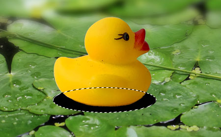
Fill it in with black:
Edit > Fill > Black

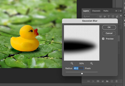
At this point the shadow looks too fake - too solid and too sharp.
Deselect (Ctrl/Command D)
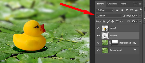
Change layer blending mode. It is hard to predict sometimes which mode would work better for you - try a few of them: Overlay, Multiply, Darken....


Use Gaussian Blur filter to soften the edges of the shadow:
Filter > Blur > Gaussian Blur

Now you can continue in Illustrator to add more graphics and text.

