use of photography
in graphic design
Photography in design can be more impactful than graphics or illustration or text alone.
A well-placed photo can tell a story in a single glance, much more efficiently than words can.
best practices:
1. Stick to high-quality photos
Bad photos will ruin a design—even if everything else looks great.
If your design needs photography - make photograph yourself, hire a professional photographer or use high-quality stock photography.
There are tons of great resources out there. Some are free (see links above)
2. Avoid clichés and generic-looking stock photography when you can
While stock photography is a great option for sourcing high-quality photos, it’s important that you choose your photos thoughtfully. Keep it human.
3. Ensure any text has consistent contrast
If you must use a certain photo, you can solve the contrast problem with one of these techniques:
- Adding an overlay
- Lowering the image contrast
- Colorizing the image
- Adding a drop shadow to your text
4. Only use relevant imagery
Users react to visuals faster than text, so make sure your content matches the supporting visuals.
Not all images improve the experience. Some of them just take up space or, in the worst case, confuse the user.
5. Less is more
Sometimes the best decision you can make is to focus on your product, so you can easily grab the user’s attention.
Let it breathe!
Ways to Use Photography in Graphic Design
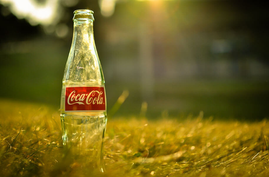
Blurred background
Blurred photos can provide aesthetically appealing backgrounds to your designs.
Blurring adds mystery and intrigue, making it a fast way to grab attention.
Whether your graphics contain text, logos, or more, a blurred photograph underneath adds originality that a typical gradient or colored background can’t.
Why does the photograph have to be relevant to your message?
You’ll be blurring it, making it almost invisible.
Hence, relevancy matters less.
Almost any image can be used as a blurred background as long as it suits the vibe that you’re going for.
Contrasts through images
Contrast helps to add a different dimension to the image.
- color contrast - use of opposite (complementary) colors
- value contrast - create a contrast between white and dark parts.
- texture contrast - emphasize the subject by giving it a different texture than the photograph.
- conceptual contrast - grab attention by combining a subject and a background that logically don’t go together.
Depth of Field
Combining the depth of field with graphics helps to create a sense of space in your design.
You can add depth of field by using Photoshop or taking a photograph with a macro setting.
Telling a Story
You can create graphics to tell a story.
That can be a comic-strip story of a series on photos or a story within a single photograph.
Creative imaging
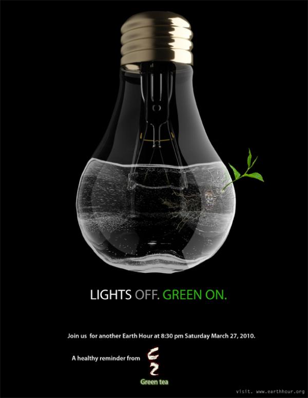
Use Photoshop to manipulate a photograph to make a statement.
...


