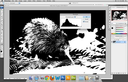
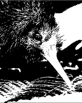
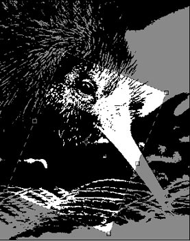
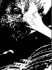
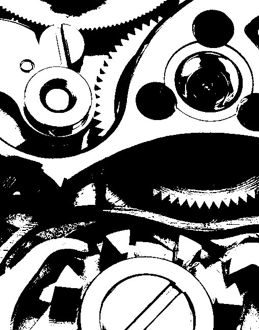
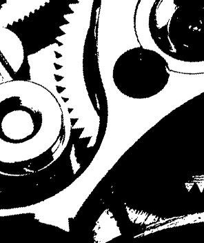
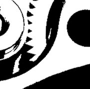
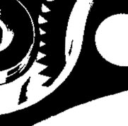
Less is More is a graphic design technique when the image is suggested rather than directly depicted.
This reductive approach is a powerful technique that a graphic designer can employ, inviting the viewing audience to interact with the artwork by mentally completing the implied image. (Gestalt principle of closure)
This problem is a six-part assignment taking the designer through various stages useful in creating such an image.
Select 3 images:
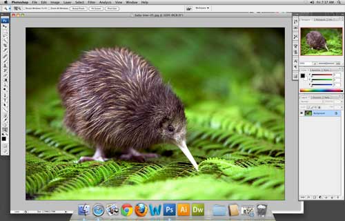
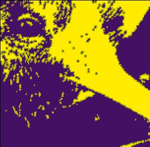
- an animal
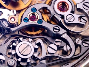
- a mechanical object
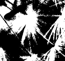
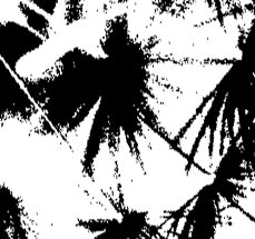
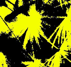
- a plant
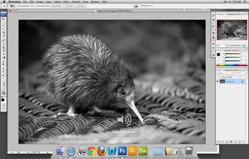
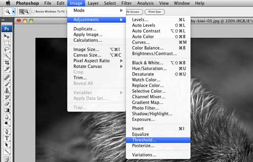
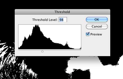
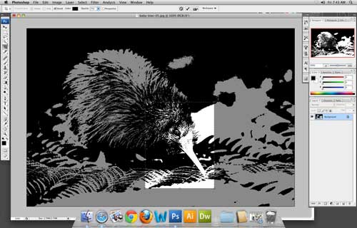
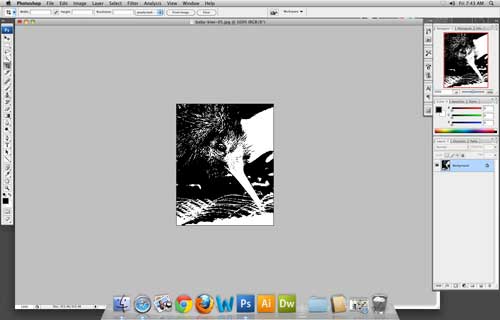
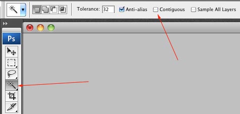
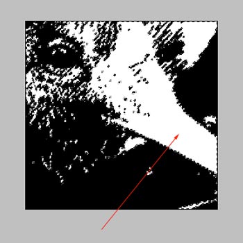
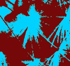
Using black and white only, you are going to design it in its entirety by simplifying its physical characteristics into flat negative and positive shapes.
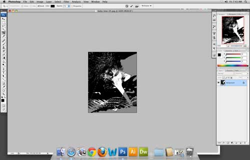
All images should be a very good quality. When lookig for images - check LARGE IMAGES options in your search options.
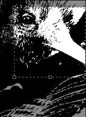
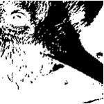
Work with one image at a time. This assignment is all about cropping and looking for attractive solutions in your design.
You will do a 3-step cropping:
- cropped to best represent the object
- mostly cropped
- abstract (square)