julianna kunstler logo
visual hierarchy

in design layouts
Instagram icon

by JuliannaKunstler.com

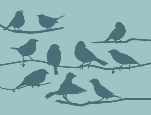
Visual hierarchy is a design principle that refers to how elements are arranged in a design.

For the audience’s purpose, it’s important that the content is organized. Books have chapters, movies have scenes, etc. That same organization also needs to be applied to page layout, both digitally and on paper. This can be done by applying hierarchy to your design elements.

Each element should be laid out in a logical manner to help the viewer sort the information from most important to least important.

Visual hierarchy is the arrangement of elements in a design by the order of importance.

The reason visual hierarchy is such an important principle to understand is because it's on the designer to create the hierarchy in such a way that the viewer doesn't even have to think about where to look first. Their eye is automatically drawn to each element in the exact order they're meant to view it.

Hierarchy influences the order in which the human eye perceives what it sees.

In design, hierarchy is used to:

  • Add structure
  • Create visual organization
  • Create direction
  • Add emphasis
  • Help a viewer navigate and digest information easily
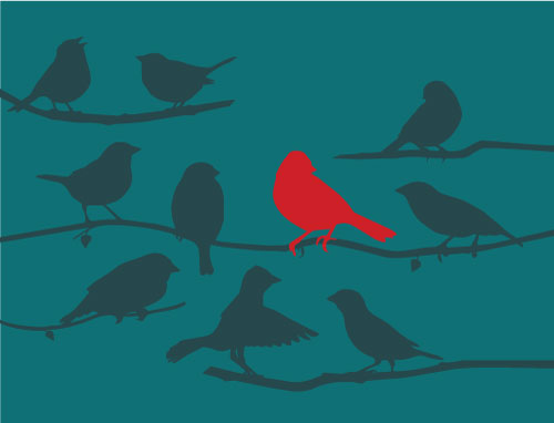
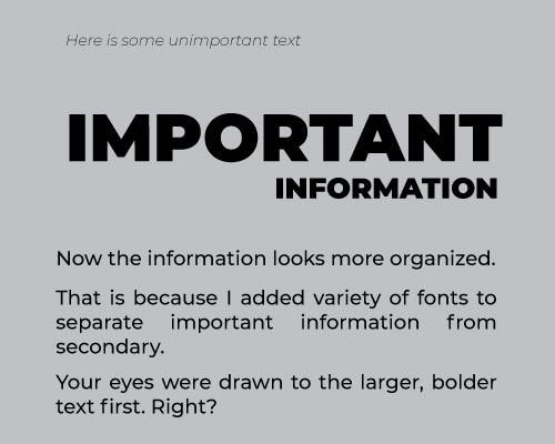
1. size

Larger elements draw greater attention than smaller elements.

It’s the precise reason why newspaper headlines appear in larger fonts, and major stories often have even larger headlines than articles on the rest of the page. 

Elements that aren’t as important can be made smaller to reduce visibility and emphasis. This moves these elements towards the bottom of the visual hierarchy.

2. color and contrast

Another way to make important elements stand out to the viewer is with color and contrast.

Just as larger elements are perceived as more important than smaller elements, bright colors usually draw greater attention than duller hues.

For example, if a single sentence in a block of text is highlighted with a bright color, it immediately grabs readers’ attention.

A design that uses too many contrasting colors will often appear unorganized and incohesive. Use art elements in moderation.


3. fonts

Typeface vs font

A typeface refers to the design of the letters and numbers (how the letters look). 

Font refers to the different weights and sizes that are within a typeface.

Typeface hierarchies can be created with text of various sizes, weights and spacing—or a combination of each element.

Even if a single font is used throughout a design, varying its size and weight not only draws attention to more important elements, but creates an overall composition that is easy to read and understand.

Typographic hierarchy

You don’t have to guess where to place those fonts. Think about what a newspaper or magazine layout looks like: heading, subheading, copy. This is the most basic approach and it can be applied to a multitude of designs, including business cards, brochures, and articles.

  • Level 1- HEADERS: the most important content on the page. Should be the first thing the reader sees.
  • Level 2 - SUBHEADERS / CHAPTERS: typography that also has to stand out, but not as much as your level one. These should help organize your design into groups or sections with related information. It should clearly direct viewers to the different parts of the design and help them navigate it easily.
  • Level 3 - BODY:  typography is used when the page is mostly made up of text. This level is often the body of the content.

4. depth

If we change the space of these shapes through overlapping, we now create a new hierarchy.

The shapes that are on top appear closer to us and they are the ones we see more clearly. 

assignment