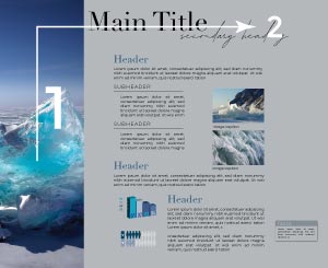
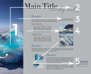
Compositional flow determines how the eye is led through a design: where it looks first, where it looks next, where the eye pauses, and how long it stays.
You want people to be presented with the right information at the right time, and one way to do that is to control the flow of your composition.
A design with good flow will lead the viewer's’ eye throughout the layout, moving from element to element with ease. You can inflience this by using a combination of type, line, contrast, color, and photography
HOW TO CREATE A SUCCESSFUL DESIGN FLOW:
Gather all your content ahead of time
Make sure you have all the text (Draft text is better than no text.)
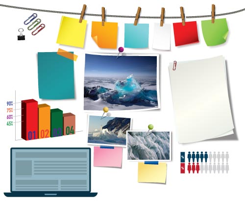
Pair imagery with your text. (Make sure they work harmoniously together.)
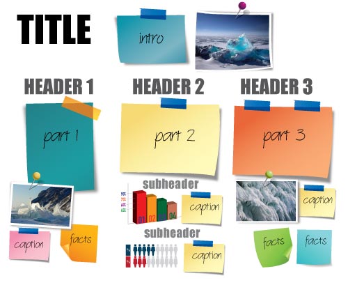
Organize your content.
What are the key information points that need to be displayed: graphics, photos, text, bullet points, etc. ?
Now, use the principles of verbal and visual flow to layout your page:
Verbal flow: The order in which the viewer reads the text on a spread/webpage.
-
First, pick an easy-to-read font for your main content. Make sure the vertical space between the lines of text isn’t too cramped or too wide.
-
Avoid extra wide or narrow column widths for your content, it impedes readability.
-
Make sure headlines and links are consistently styled.
-
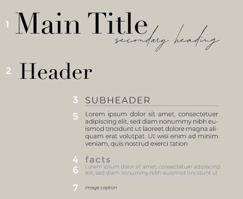
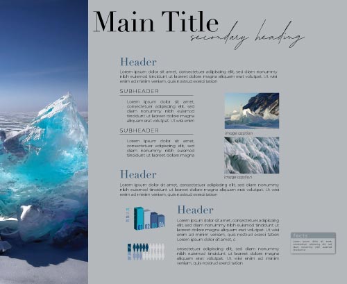
Make sure you have a clear visual hierarchy where the headlines are the largest type, followed by subheads, then body copy. You can also add in some quotation styles and bullet points to break up the text blocks.
-
Keep layouts consistent from one page to the next (use the same fonts, type sizes, column widths, etc.)
-
Understand and organize your content so that related items are closer together.
-
Make sure to have plenty of white space or padding around elements. This gives the viewer a place for the eyes to rest.
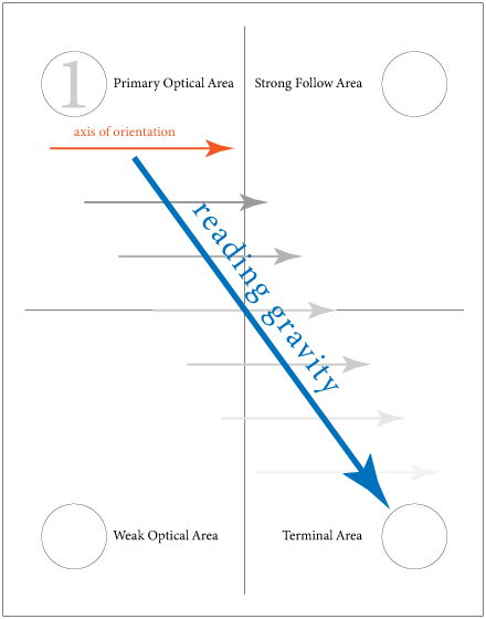
Visual flow: The order in which the viewer looks at images and graphics on the webpage.
-
Generally, visitors will gravitate towards the most prominent visual on the screen, often a photo but sometimes a headline or call-to-action.
-
Imagery should be selected carefully so that it enhances the message you are trying to convey, not distract from it.
-
Remember your goal is to get visitors to your call-to-action. Ask yourself, “what do I want my users to find first”? Then make it easy and quick to act on it.
-
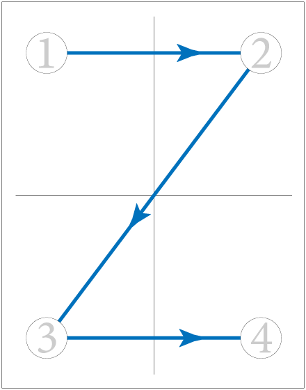
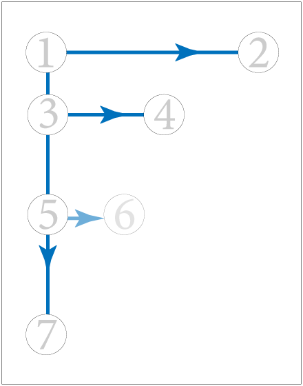
Use the direction of images to control the speed and direction of flow.
-
Create barriers when you want to reverse the eyes’ direction. (For example, you can use color blocks or whitespace to guide the viewer around.)
-
Create open paths to allow easy movement through your design.
-
Use contrasting colors and shapes to pull the eye where you want it to go.
...