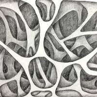
worksheet 1
Print out the worksheet 1.
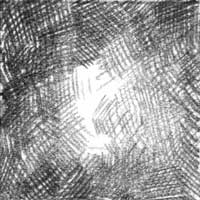
Use a drawing pencil to complete the shading.
Use harder pencils (H - 3H) for lighter and detailed shading.
Use softer pencils (B - 3B) for darker, less detailed shading.
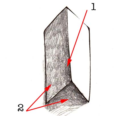
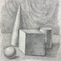
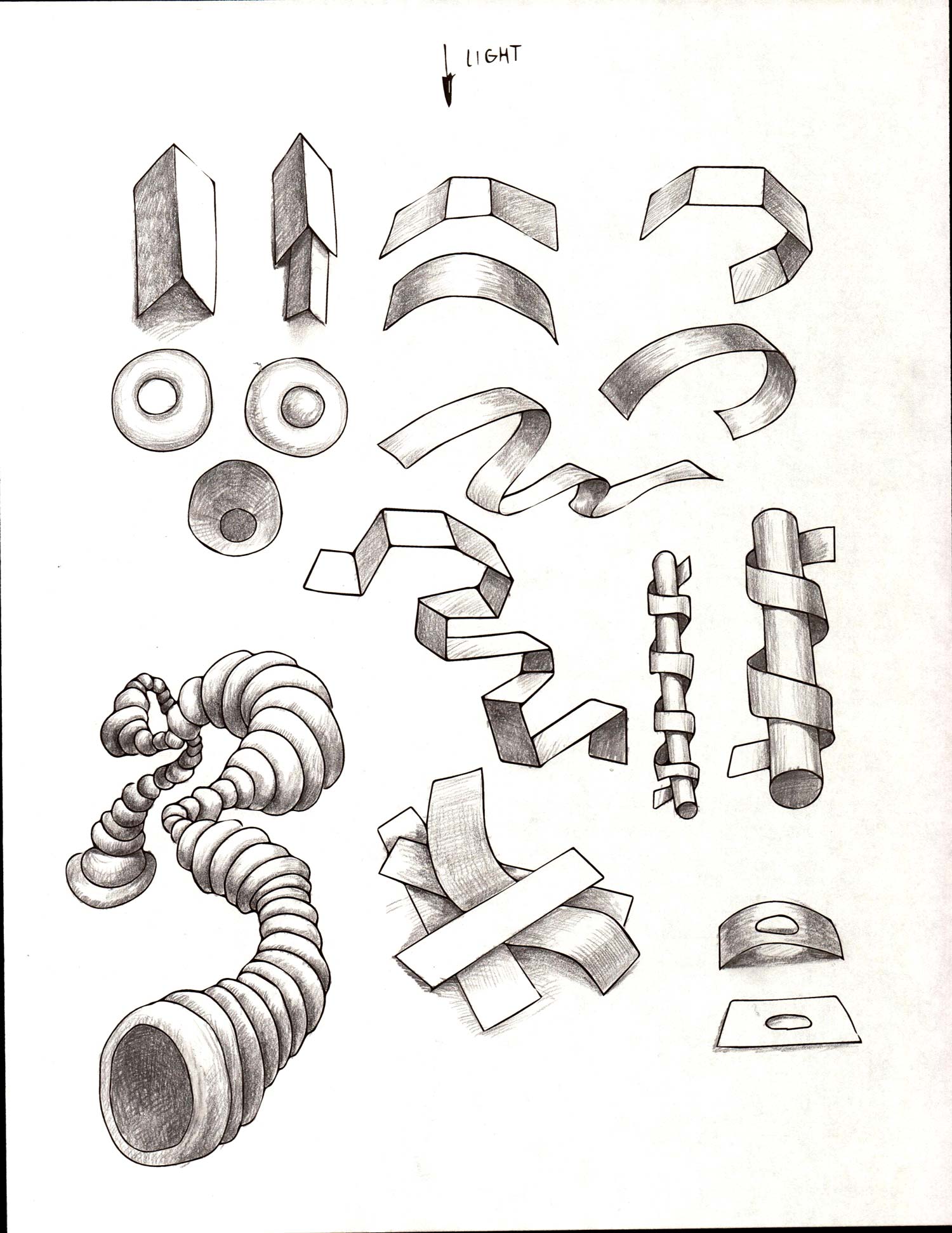
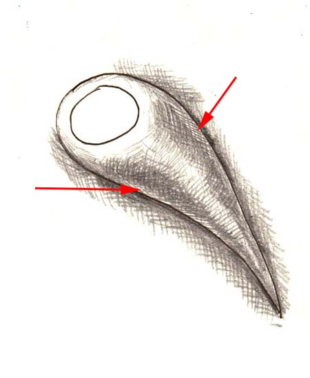
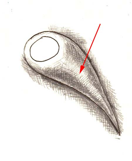
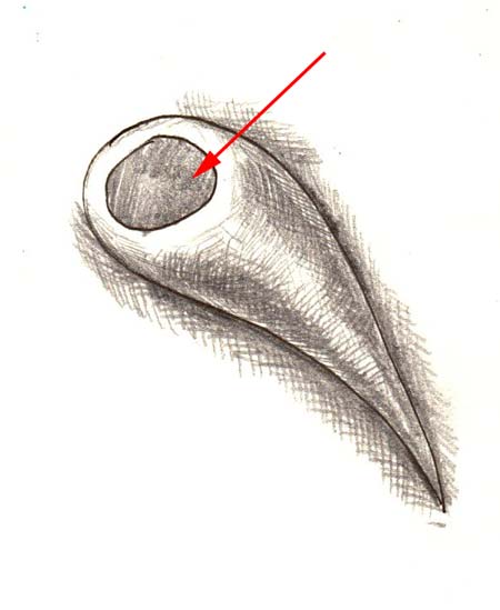
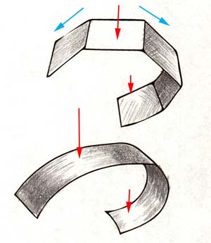
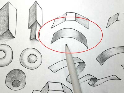
Two surfaces, facing different directions, cannot be the same value.
If one surface is facing the light source - it will be the lightest one - the right side in this image.
The surface that does not directly face the light source will be in a shade or will get partial light. In any case it will always be darker than the one facing the light.
Shade darker the area of biggest contrast (1) to emphasize it.
Shaded area and drop shadow are not the same value (2). Drop shadow is always darker.
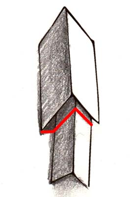
Drop shadows follow the shape of the form.
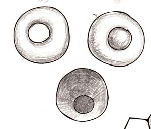
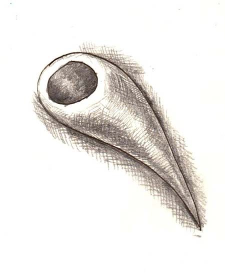
You can change the way your design looks by manipulating the shadows.
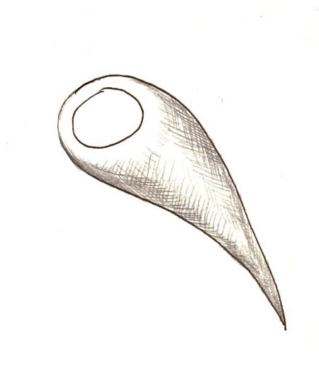
These three forms were very similar before they were shaded.
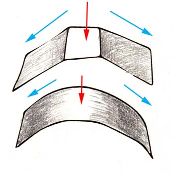
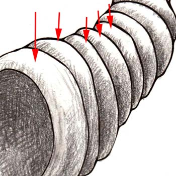
Some surfaces (or parts of surfaces) get partial light.
Transition between directly lit and partially lit areas can be sharp and contrasted (top image) or soft and gradual (bottom image).
Always be aware of the position of your light source when shading.
Have your strokes follow the form to support it.
Experiment with different forms.
Have your light source be consistent throughout the design.
Try to blend your strokes for smoother transitions.
Use a tortillon or paper tissue.
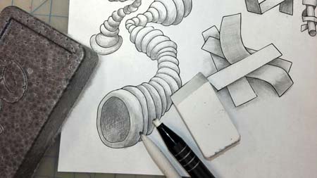
Eraser can be use as a drawing tool to restore highlights and to lighten values.
Dry board eraser is great for cleaning your drawing surface from pencil and eraser crumbs.
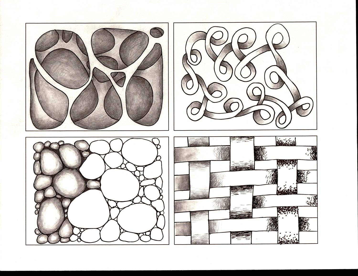
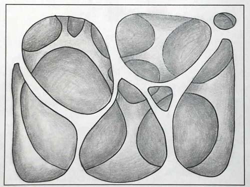
worksheet 2
Print out worksheet 2.
Practice shading. The goal is to add depth to the flat designs.
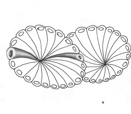
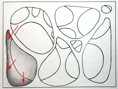
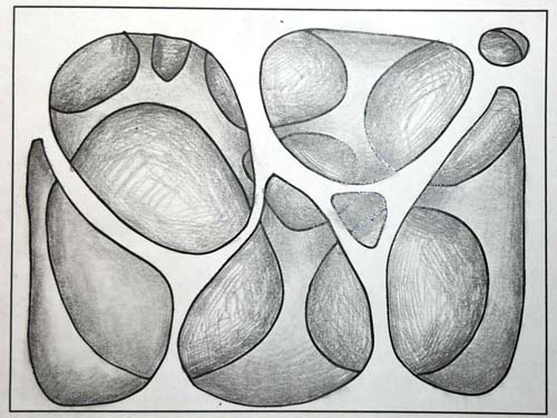
Design 1
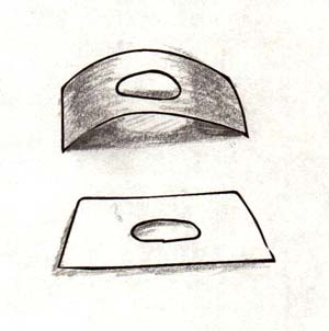
There are two "layers" with holes in this design.
You need to add drop shadows inside the holes to make it look 3D.
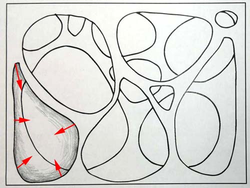
Start with top "layer".
Shade inside each hole - starting at the outline and gradually fading towards the center.
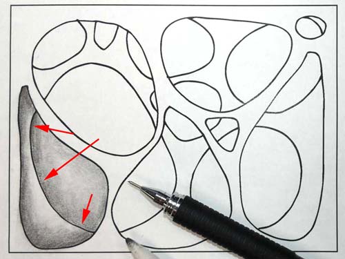
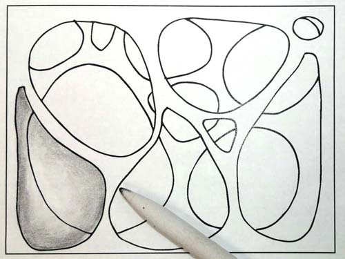 You can use a tortillion (or tissue paper) to blend the strokes.
Note:
Start blending from the lightest shaded areas. Then continue to the darkest.
Use circular motion for better blending.
Add more contrast (make darker) the areas that are parts of layer 2.
The areas that are parts of the background do not need to be darkened at this time.
Add drop shadows to layer 2.
Follow the same technique: darker right next to the outline and gradually fading away.
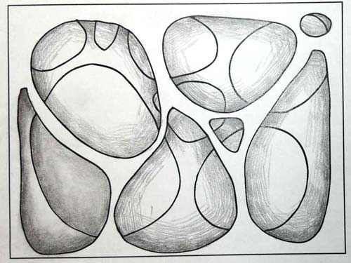
Continue with the rest of the design.
Blend strokes if you want to.
Drop shadows are always darker than the layer value - regardless of whether it is in the lit area or a shaded one.
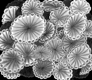
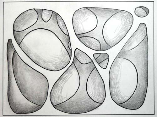
Here is a finished design.
You can manipulate the distance between the layers by altering the length of the drop shadows - longer the shadow - further apart are the layers.
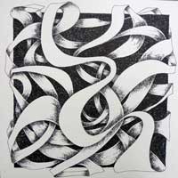
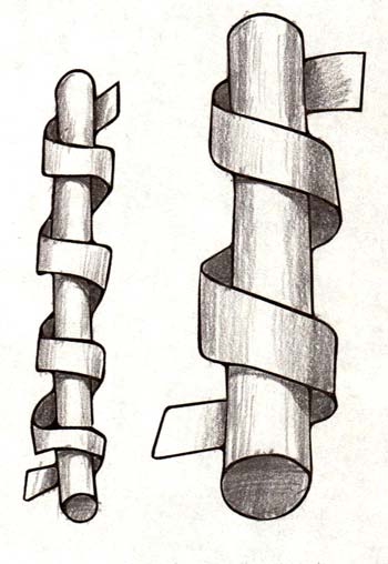
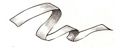
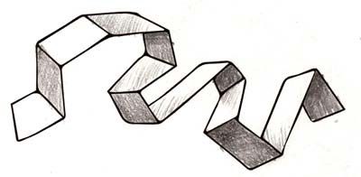
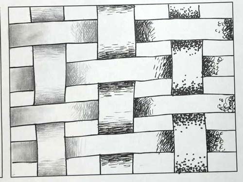
Design 2
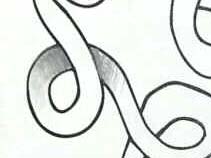
The next pattern is a twisted band with overlapping parts.
Shade each of the overlapping units where you
- keep the top band White
- shade the bottom band starting dark at the crossing and gradually fading away
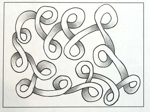
You can blend strokes if you want to.
Design 3
Pencil is not the only tool you can use for shading.
Try different shading techniques with pens and markers.
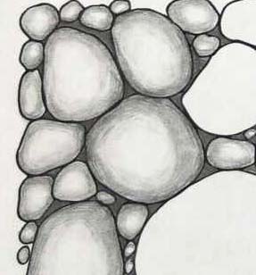
Design 4
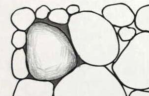
Always take your time when shading.
Use short strokes as they are easier to control.
Follow the shape (form) as you shade.
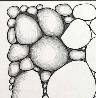
You can control the "roundness" of the pebbles as you shade.
If you leave a small white space - the form will look higher and more round.
If you leave a larger white space - it will look flatter and not as high.