Design tips
1. Fonts

Using a unique font can be a great idea to make it stand out from Arial and Times New Romans, but don't go too fancy. Make sure it is legible. Stay away from Papyrus, Comic Sans, and fonts like that. They do not look professional.
For the body text:
- Use serif fonts for printed version.
- Use sans serif fonts for online view.
- Font size between 11 and 13 points.
For headers text: you can get more creative with a font choice
Stay consistent with all headers and all body text blocks.
You can combine 2 (two!!!) fonts in your resume, just don't pick fonts that look very similar. Read here.
2. Focal point
Make your contact information easy to see and read.
Use small graphics/icons to make it easier to spot the information, but keep them in the same style.
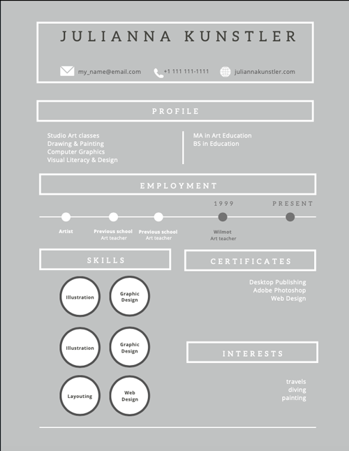
3. Layout
Make your resume easy to read or to skim through. A person, who is going to read it, will spend about 6 seconds on your resume. Make these seconds pleasant!
That means you need to organize it in such a way, that
- all headings and info blocks are easily found,
- there is no unnecessary clutter in the design
- everything is consistent
- all elements are aligned!!!!
- consider using columns
- easy text formatting: headings, sub-headings, bullet points, alignment
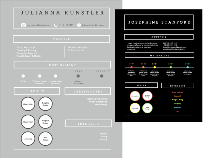
4. Colors
Choose a color scheme and stick to it!
Use colors carefully. Black and White are also colors.
You may add a few more colors, but stay consistent. Use the same color for a heading and a bullet point, for example. Don't make it look like a fruit salad! We are talking about your resume here!
More design tips
Canva steps

Start with a Resume template search.
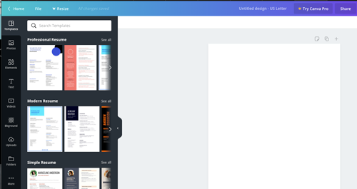
Browse through different layouts.
Find the one that looks interesting to YOU.
Please keep in mind that you are going to change the colors and manipulate most of the content.
So don't feel like you are stuck with the design.
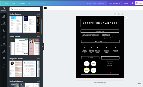
Once you picked a "base" layout, look at the existing headings and sections.
Decide what you need to add, adjust, modify to fit your needs.
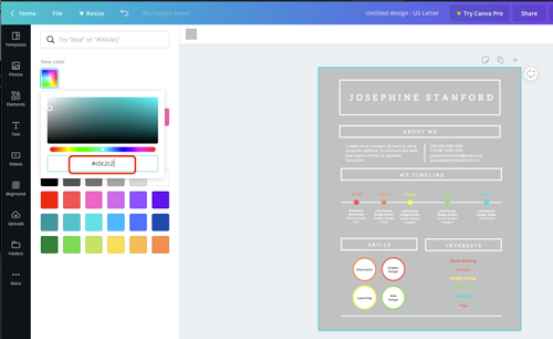
Use your color palette (from the previous project) and apply colors to design elements.

Don't hesitate to move text blocks around to better fit your goal.

Look for extra graphics if you need them.
Don't overdo it though! Less is more!
Make sure you are consistent with your color scheme.
Continue working on the layout to fit all information you need.
Keep it to the point though....