You are going to create a portfolio of your works for this semester.
First, create a folder "PORTFOLIO"
You should have the following files available:
- a photo (scan) of Andre Breton assignment
- a photo (scan) of your BEST Geometrical doodling assignment
- Jack & Jill (Ai file)
- Aesop fable (Ai file)
- 6 files (photos) of Pushpin assignment
- Map assignment (Ai file)
- a photo (scan) of Road signs
- a photo (scan) of your value scale
- a photo (scan) of Color Wheel
- a photo (scan) of Texture drawing
- Word document of Gestalt logo critique
- Gestalt squares (Ai file)
- Name design (Ai file)
- All images for "Less is More" assignment
- Initials (Ai file)
- Wilmot logo (Ai file)
- Typography 1 (Ai file)
- Typography 3 (Ai file)
- Word document of Target audience file
|
 |
Open Adobe InDesign
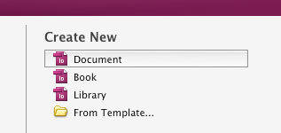
Create a new document.
|
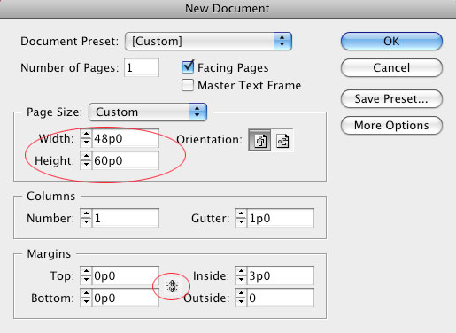 |
Set up the page size. (you can type in inches, it will convert them into points)

Set up margins. I like to have them at 0, but you feel free to set them up to your liking.
|
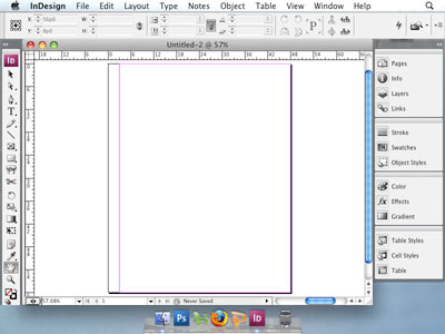 |
Click OK and you will see your first page.
|
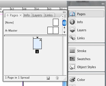 |
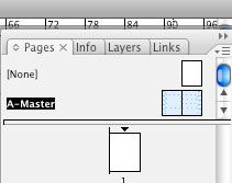
Open Pages panel.
Here is your book's layout.
So far you have only one page. That's what you see.
At the top part of the panel you see your Master pages (works great if you have multiple pages with the same design layout). Right now your master pages are blank.
Your first page is a clone of your right master page spread. (you can see an A symbol on it)
I do not want my title page to look like the rest of the book. So... I remove Master page layout from it.
|
Drag "None" setting onto page 1
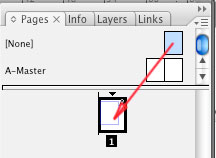
|
This is what it looks like now.
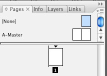
|
Now it's time to create a Master spread.
Double click on the left page of the master spread.(this is like working on a template)
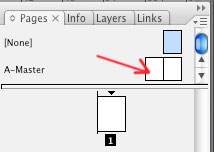
|
|
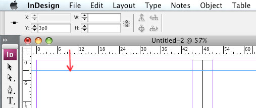 |
Remember, I changed the margins to zero?
Now I am using guides to align everything on my pages. Remember the "grid layout" concept? Everything should make sense. Images, shapes, and text - are just visual elements. Organize them!!!!
|
A good idea is to have your text aligned at some distance from the edge.
Pictures and graphics can be cropped, go off the page, or be aligned to the text.
Your choice. Just be consistent in your design. |

|
 |
Use Type tool to place text boxes.
Use Placeholder tool to draw areas for graphics.
Use shape tools to add extra shapes to your design.
The design should be fun, but still readable.
|
 |
Work on left and right Master pages at the same time. When you look at a book - you see both pages together. So design and align the elements keeping this in mind.

|
I created just a basic layout.
|
|
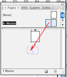
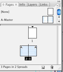
Add pages 2 and 3 by dragging the master spread.
|
Your new pages should already have the designated areas for the text and pictures.
|
 |
All boxes are locked.
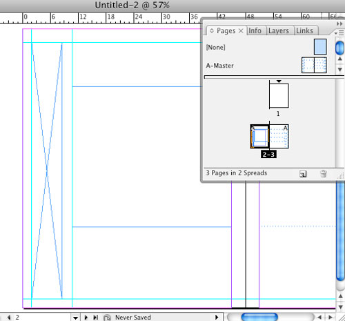
You need to be able to type in text and insert images. Right-click on page 2.
Choose Override All Master page Items.
|
 |
Usually, page 2 is a blank page. Or you can add some designs and information there (like a dedication or a year)
Select everything on this page and delete.
Now you can add your stuff here.
|
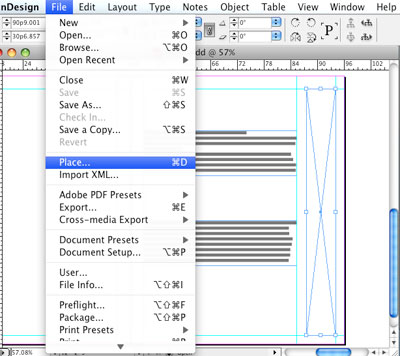 |
Go to page 3. Release all items on this page. Insert text in text boxes. Select Image placeholders and insert graphics by going to File > Place
Make sure all your images are all in the same folder as your book file.

|
 |
After your image is placed, you can resize and move it around by using Direct Selection tool (white arrow for the content of the placeholder)
|
 |
You can add more text boxes or images to your pages.
Do not use more than 2 or 3 typefaces. Be consistent: all chapter titles should look the same, page numbers, picture captions, etc.
|
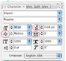 |
Use Character panel to adjust spaces between letters (except for the large bodies of text).
You can adjust spacing between the baselines.
Space between two letters.
Space between all letters in the selection.
|
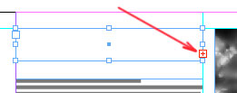 |
If your font size is too big, or you have too much text for the text box - you'll see this red symbol.
Easy to fix: change the font size or reduce the amount of text for the area.
|
 |
To change the Type color: Click on T in the Toolbox.
|
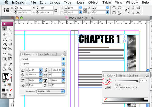 |
...or in the Color panel.
After that you can apply any color to the text.
If you don't click on the T, the color will be applied to the background of the text box (which is fine if this is what you want).
|
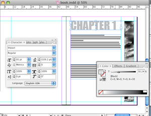 |
Pay extreme attention to large size text. It is a focal point and you want it to be perfect.
|
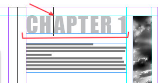 |
You might want to consider tracking to spread the letters for alignment purposes (or just because it looks cool!)
Use kerning to adjust space between letters that look too close (like, in my case, I had to fix a space between H and A).
|
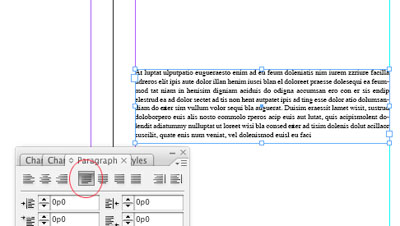 |
You might want to consider justify option for your paragraphs.
|
 |
Try to be creative ant think outside the box.
Use cropping.
You can also add other images or placeholders to the page.
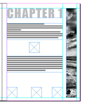
In my example I decided to add 4 placeholders that would reveal the same image that I already have on the page.
How it works? Easy.
Select all placeholders (including the one with the image)
|
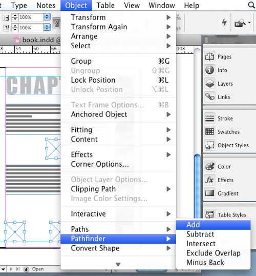 |
Object > Pathfinder > Add
This will combine all selected placeholders into one placeholder (even though they are not connected)
|
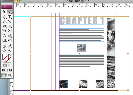 |
Place the image again - and you just created some cool interest!
|
 |
Work with text like they are just shapes or visual elements. Overlap them, rotate then, etc... (well... to a degree, of course, don't overdo things! keep it elegant)
|
 |
If the outlines of the text boxed and placeholders irritate you, you can hide them: View >Print Overview
|
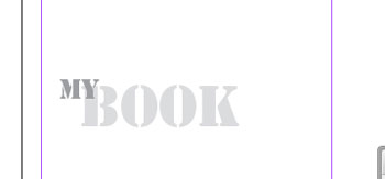 |
Something like this. Enjoy!
|