Bring a product label to class (from a soup can, crackers box, etc).
You are going to use all typography, found on the label to create a design - grid-based square composition.
You can change the appearance of the typography by:
changing size, weight, fonts, position, emphasis, creating visual patterns or a dynamic composition, you can have the text follow curved paths, intersect the type lines, etc.
Treat type as you would treat a design elements.
You can add geometric shapes and(or) make shapes out of the type body.
You can add up to 2 colors to the design.

The design should be based on a grid.
Have an explanation for each element you place in the design.
The design should be balanced (symmetrical or asymmetrical balance)
The design should be visually pleasing and interesting.
Start with sketches using the worksheet.
Think how you'll break the text from your label into text boxes, text ribbons, what shapes (if any) you want to add, etc.
Open Illustrator.
The design should be 6"x6"
Place a 2" grid over the area.
Place 1/8" margins inside each 2" square. Subdivide squares into 1" parts.
Then start executing you best design sketch.
There are limitless layout possibilities for the grid design.
You can use each square for your elements, few squares for an element, circles, curves, and other non-square shapes should be aligned with the grid guides.


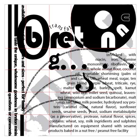
For example:
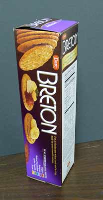
This is the box I used for my design.
I used all the text that I could find on the box (including the nutrition facts and calories count)
I decided what words, letters can be emphasized (not necessarily the brand name - choose any word or letter)

Then I started to sketch.
Just brainstorm. Have at least 5-6 thumbnails for the design. Chances are - you going to combine the ideas into one design.


Then open Microsoft Word.
Type all the text from the product.
Open Illustrator.
Cut and paste the pieces of the text while arranging the text according to your design.
Make sure you follow the grid - keep everything aligned.
Try to forget that you are working with type - think "SHAPES"
Keep in mind - I will be using a grid to check your alignments!!!!
