julianna kunstler logo
Typography

project 2: Sequential Typographic Forms in Space
Instagram icon
 

by JuliannaKunstler.com

STEPS

By cropping, shifting, rotating, and scaling a large sampling of single letterforms within square modules, students discover the dynamic relationships between form and counterform and the resulting effect upon visual space. Students then proceed with a study of typographic kinetics by organizing selected modules into a linear sequence of ten modules.

Similar to musical scores, diagram sketches enable students to articulate and test sequences with respect to rhythmic patterns, shape and value transitions, and the flow of typographic elements.

Design a vertical typographic design using the letters of you last (or first) name.
Use a square module for each letter.


Create a set of square modules that equals the number of letters in your name.

Duplicate the set of modules:

Set # 1
Fill in every other square with black.

Set # 2
Fill in the top half with black.

Set # 3
Fill in the center squares with black.


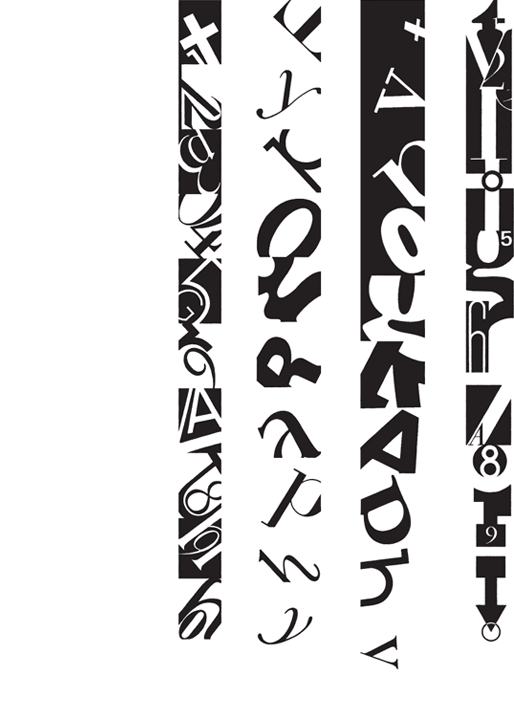
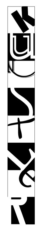
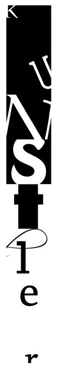
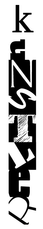
Place letters in the square modules:

Black letters into white squares and white letters into black squares.

Use variety of typefaces.

Rotate and resize them. Change the weight of the letterforms.

Crop!!!!! Cropping creates interest!!!

To crop:
1. Position the letter over a square.
2. Convert letterform into shape: Type > Create Outlines.
3. Select the letterform and the square.
4. In Pathfinder palette (Window>Pathfinder): Divide
5. Object > Ungroup (or right-click)
6. Deselect
7. Delete all extra shapes.

Each module should be visually interesting.

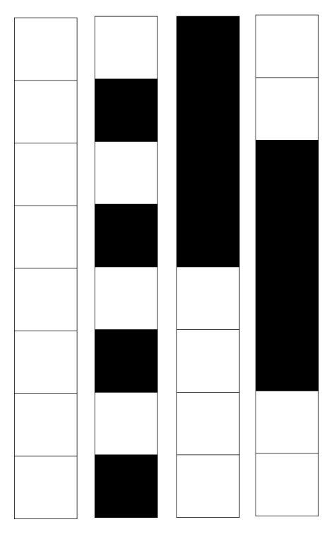
Design 1: Create a pattern of equally balanced modules.

Design 2: Create a "value scale" by managing black and white shapes. Amount of black should go from maximum in the top module to the minimum in the bottom.

Design 3: Create a value gradation from light to dark to light.


Arrange all three designs together and print them!


Questions? Figure them out!

Thanks to http://www.typographicdesign4e.com  
.
...