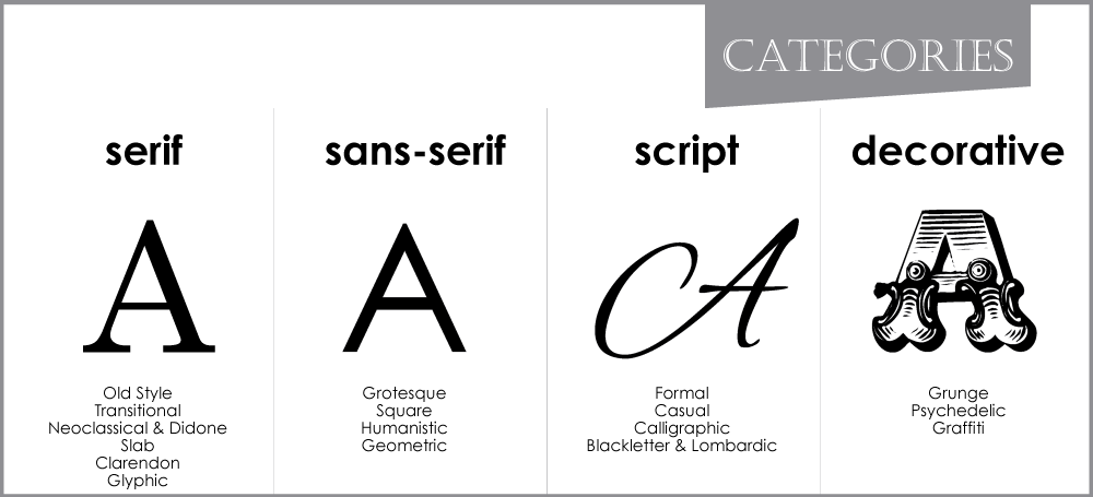
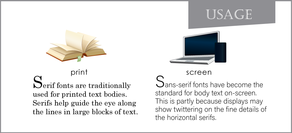
by JuliannaKunstler.com
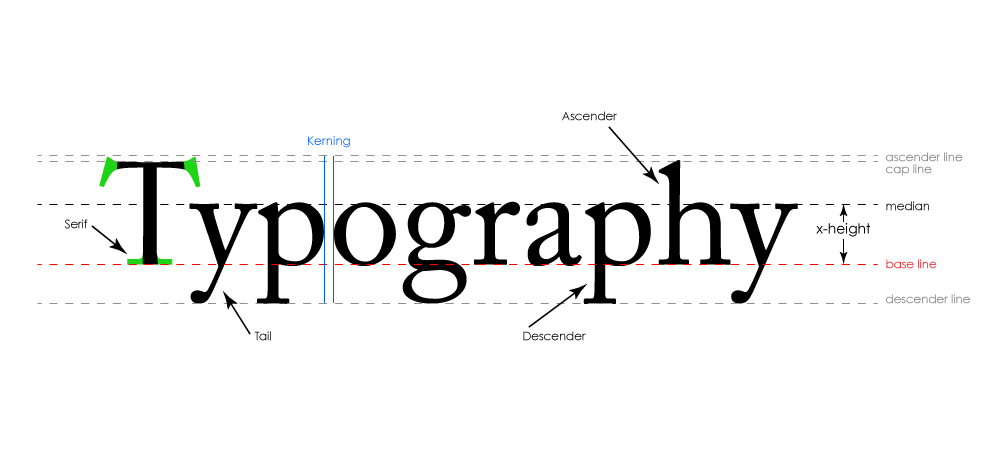
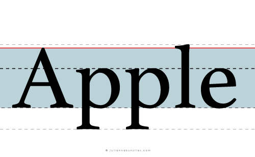
typography anatomy


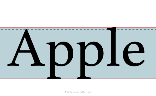
Font weight

Font styles

rules of typography
The use of fonts should be imaginative, original, and purposeful. Fonts are often a great opportunity to add life to a piece of Graphic design.
The shape and appearance of a word can say as much as the word itself can. That’s why it’s important to use fonts well.
Good graphic design usually employs consistency and restraint in choosing fonts.
1. What is your goal?

Every font has a personality. Choose a font with a personality that fits well with the other elements of the project. When this is done properly, the message is powerful.
When it’s done poorly, the piece will struggle to say what it means.
Who is your audience? Who is going to view your design? What's the purpose of it? What do you want to achieve with this document (get a job interview or invite friends to a party?).
Pick a font that matches your audience's expectations and the purpose of your document. Look for fonts that mix well with the message.
2. Avoid default fonts

Avoid default fonts in your design!
If a work is using common fonts like Arial, Verdana, and Times New Roman, that instantly loses a few points for being boring and uninspired.
It's not like they are bad fonts - they are great for an email or a paper that you are working on, but design..... no.
3. Please, stay away from cliches

Not these fonts!
Definitely not!
4. Do not distort type
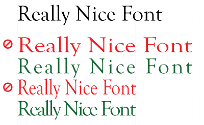
Stretching and squishing your type to make it fit is NOT COOL!
Someone might have spent hundreds of hours to design this font. Do not ruin it.
Use kerning and tracking settings to manipulate the space between letters, not the shapes. You will achieve the same result, but without vandalizing the font.
5. Use two fonts. Three if necessary

How many different fonts are used? Count them. If there are more than three, then the design piece is dangerously close to being labeled bad.
One for the headers, one for the body text, and a third for special accents.
Any more, and you risk losing your audience in a sea of confusing textual clutter.
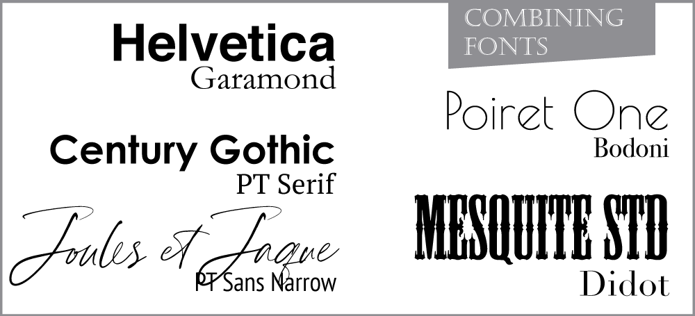
6. Combine fonts correctly

Here are some basic rules:
- 1 Combine a serif with a sans serif
- 2 Avoid similar classifications
- 3 Contrast font sizes
- 4 Contrast font weights
- 5 Assign distinct roles to each font
- 6 Don't mix different moods
- 7 Mix distinct fonts with neutral types
- 8 Avoid discordant combinations
- 9 use fonts from the same typeface
- 10. Stick to 2, max 3 typefaces
- 11. Experiment with different sizes
Contrast is good.
Pair serif and sans-serif fonts.
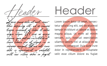
Two similar fonts is not good
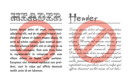
Don't mix different moods

Use same era fonts
7. Keep the text readable

Pay attention to the text size.
Do not use fancy fonts for a large amount of text.
8. Keep it simple

If you are not sure which fonts to use - use one font family with different weights. It's OK.
9. Using All Caps and All small caps

Using all caps and all small caps is great for a header.
Using all all caps in a text block is not cool. It slows down the reading and appear to "yell" at the person reading. Don't do it!
10. Know how to decorate text
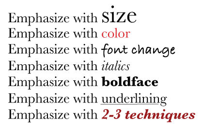
Emphasizing a part of your text is an important part of text readability.
But!
Never highlight too much. Usually, not more than 10% of the entire text. Otherwise it looses its purpose.
And do not use more than 2-3 highlighting techniques in the same text. In other words, do not pile into one design color change, boldface, italic, font change, underlining, and others.
more info
Credits: thevisualcommunicationguy.com

