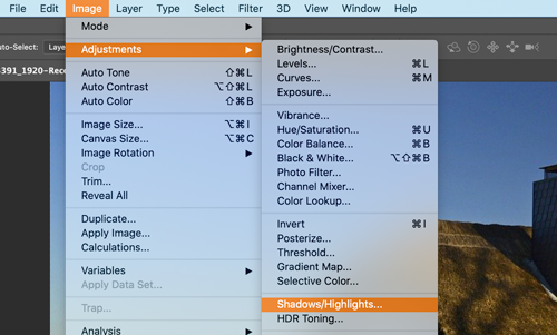
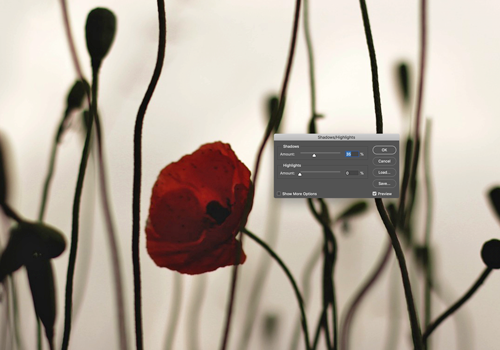
julianna kunstler logo
contrast & levels

using Photoshop
Instagram icon

by JuliannaKunstler.com

Let's talk about contrast in images.

Contrast is the difference in brightness between light and dark areas of an image. Contrast determines the number of shades in the image.

This is one of the tools to make a good photograph great! Contrast is a tool that photographers use to direct viewers’ attention to their subject. Knowing how to use contrast will help you create eye-catching images.

Contrast is what creates the textures, highlights, shadows, colors and clarity in a photograph.

Here is a great resource about contrast:

skylum.com

Types of tonal contrast:

low contrast:

Retains detail but tends to lack dimension,
looks soft.

normal contrast:

Retains detail and dimension,
looks crisp

high contrast

Loses details,
can look cartoony or posterized

Black & White

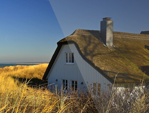
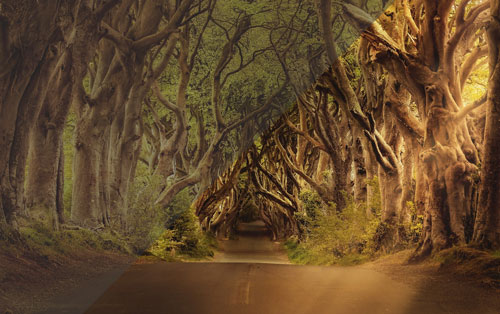
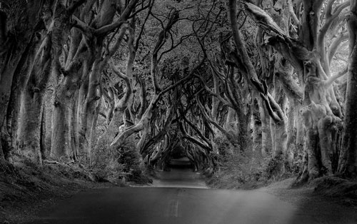
An easy way to see tonal values is to view an image without color distraction.

You can make an image look Black and White.

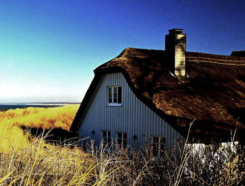
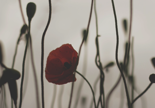
Color photography is indispensable when colors and shades, or hues, in your image are distinctive and vivid, allowing you to see even the most intricate details.

Black and white photography is the better option when you want to focus on the subject and the textures in an image without being distracted by colors

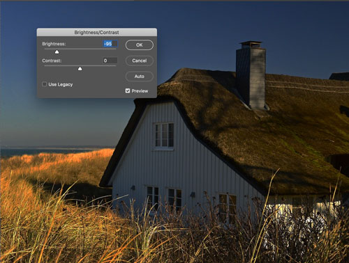
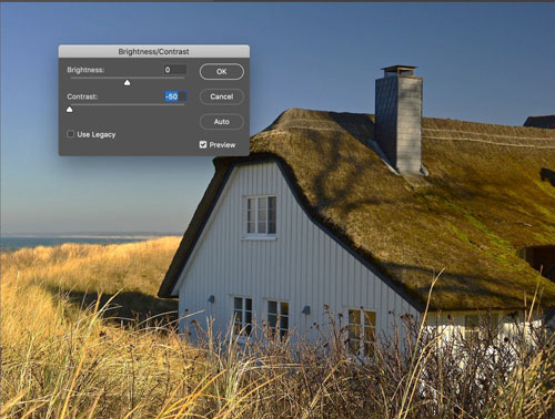
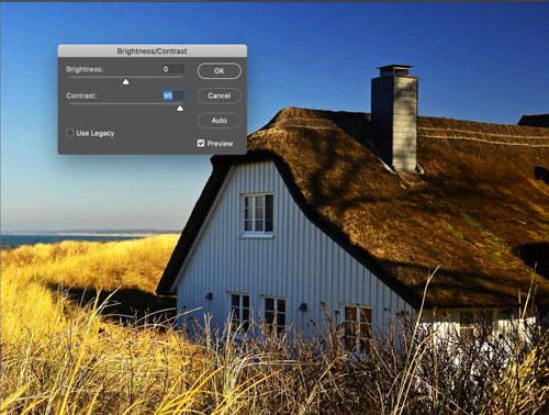
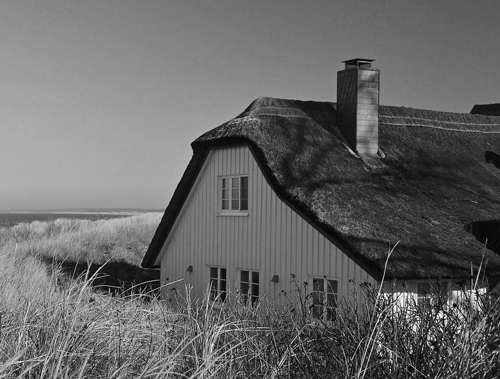
Black and white effects can help bring out the drama in your images.

There are multiple ways to do so. Here are just a few:

1. desaturate image

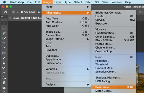
Image > Adjustments > Desaurate

This will remove all color information (hue and saturation) from the pixels, leaving only value.

Please note:

This is a permanent command. There are other ways to desaturate an image without loosing the color info, but you will learn about it later.

2. Black & White

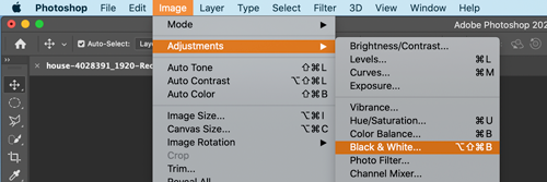
Image > Adjustments > Black & White

This will also allow you to manipulate the contrast of the image.

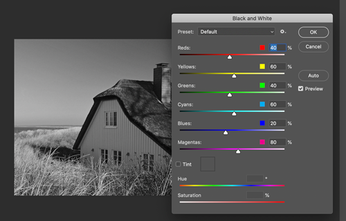
In a pop-up window: you can choose a default preset to convert colors into greyscale...

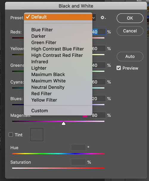
Or you can choose any of the available presets from the menu.

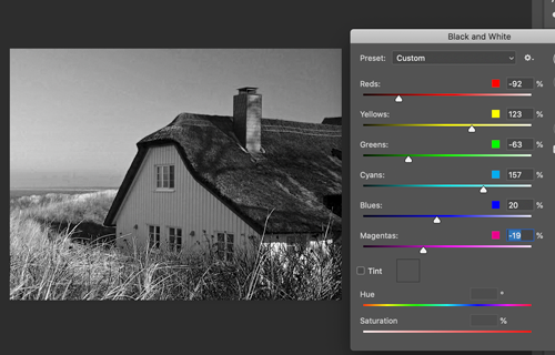
Or you can manipulate the conversion yourself by moving the color sliders.

Make sure you have the Preview button checked to view the changes.

3. Greyscale

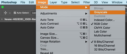
You can also convert the image color mode:

Image > Adjustments > Mode > Grayscale

But this will affect the entire image file and will mot allow you to add any color at all, even a colored text....

If you do not care about adding extras to the image - this is a good way to save and print a black-and-white photograph - this way printer would use only Black ink for printing. This is a great idea if you order your prints online - sometimes you initially black-and-white images come printed brown or green.

Brightness / Contrast

The Brightness/Contrast adjustment lets you make simple adjustments to the tonal range of an image. 

Moving the brightness slider to the right increases tonal values and expands image highlights

to the left decreases values and expands shadows

The contrast slider expands or shrinks the overall range of tonal values in the image.

Levels

You use the Levels adjustment to correct the tonal range and color balance of an image by adjusting intensity levels of image shadows, mid-tones, and highlights.

The Levels histogram is a visual guide for adjusting the image key tones. 

If we represent pixels as Lego pieces...

Your image could look like this if zoomed in...

We can organize the pixels by tone (value) - dark to light.

Something like this:

If we remove the color property, we will see just the tonal values.

More pixels with a specific value we have in the image - higher the stack.

These are the steps to improve contrast:

step 1:

Open Levels histogram

Note where it starts and ends in regards to Black and White on the value scale.

step 2:

Move Black slider to the right - to the start of histogram

step 3:

Move White slider to the left - to the end of histogram

step 4:

Adjust mid-tone slider as needed.

If you reopen the Levels Adjustment window - your histogram should look like this - with a full range of tones from black to white.

Shadows / Highlights

The Shadow/Highlight command is one method for correcting photos with silhouetted images due to strong backlighting or correcting subjects that have been slightly washed out because they were too close to the camera flash.

The adjustment can also be used for brightening areas of shadow in an otherwise well‑lit image.

The Shadow/Highlight command does not simply lighten or darken an image; it lightens or darkens based on the surrounding pixels (local neighborhood) in the shadows or highlights. For this reason, there are separate controls of the shadows and the highlights.

The defaults are set to fix images with backlighting problems.

Assignments

assignment 1

Find 2 images

  • high tonal contrast
  • low tonal contrast

For example:

assignment 2

Download the image.

Improve image contrast.

Make image black-and-white.

...