The secret to any good design lies in the way its visual elements are organized and positioned in relation to each other. This is exactly what layout design is all about.
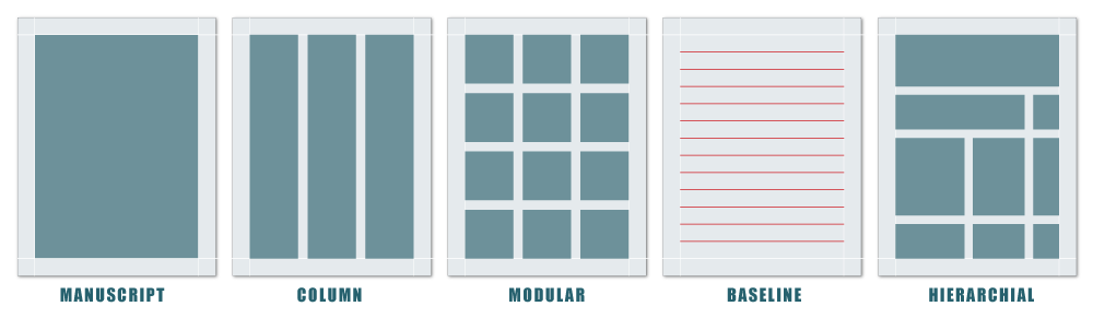
One of the chief uses for a grid is to keep your elements aligned and ordered, and your page design clean and neat. This is because grids encourage alignment, that’s a big part of their job description actually.
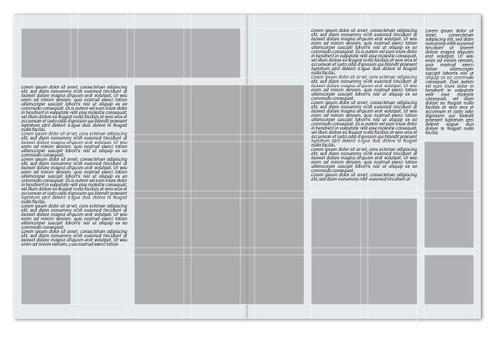
A grid is made of up of horizontal and vertical elements and modules that create a structure for your work. Because grids create a system, they can help a designer ensure that a layout is balanced and has a good sense of proportion.
format
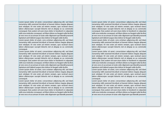
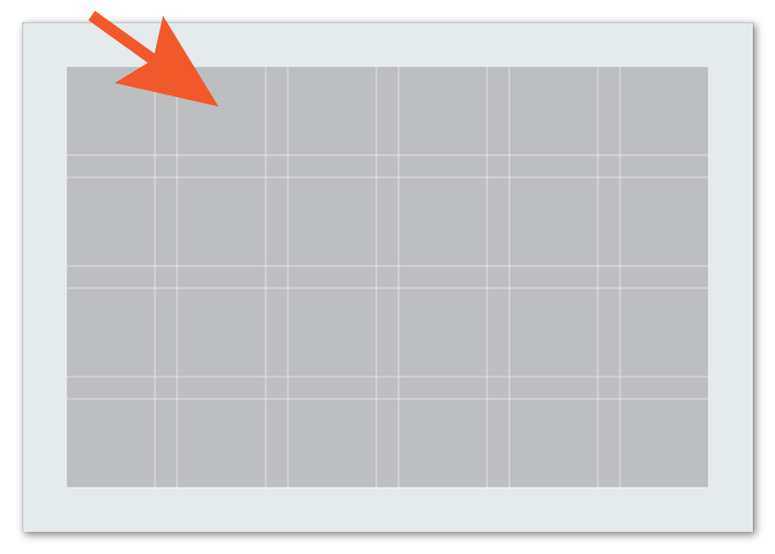
The format is the full area where the final design will be laid out. In print design, the format is the page and in web design the format is the browser window.
content
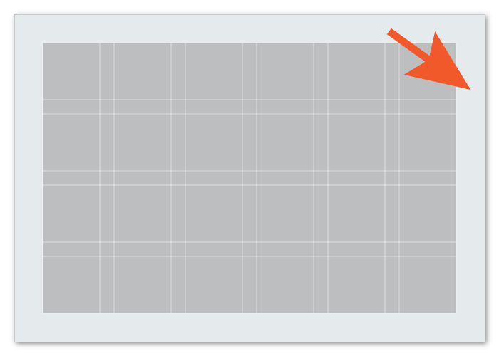
margin
Margins are the empty spaces between the edges of the format and the content. The size of the margins is what gives the content a general shape, usually a rectangle.
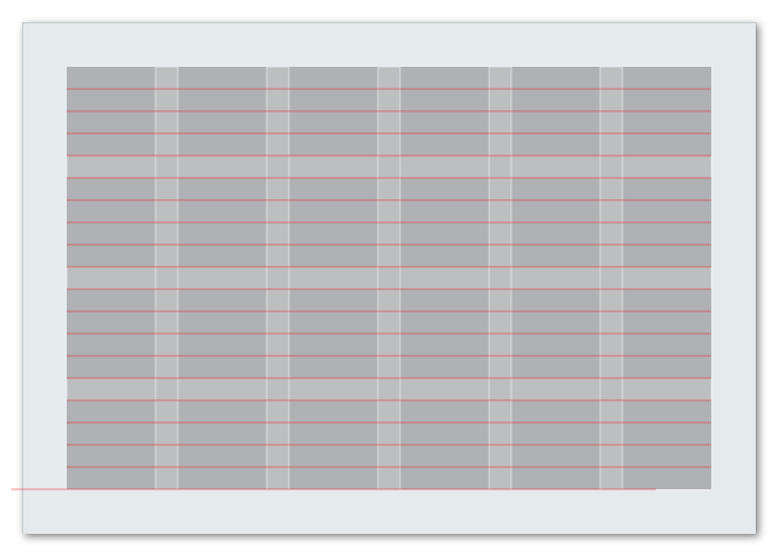
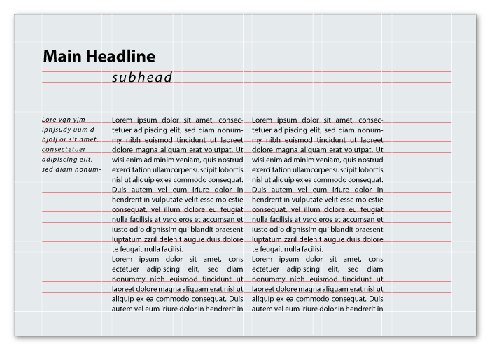
flowlines
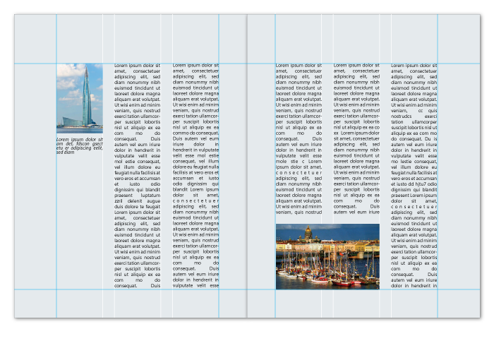
Flowlines are horizontal lines that separate the different sections of a grid into parallel bands. They help the reader follow the content of the layout.
Flowlines also create stopping points, or edges for the elements to be placed on.
Some flowlines are called hang lines and others are called baselines.
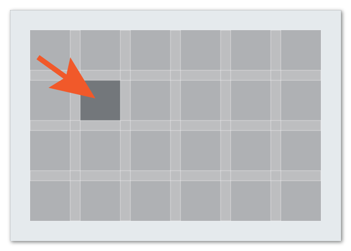
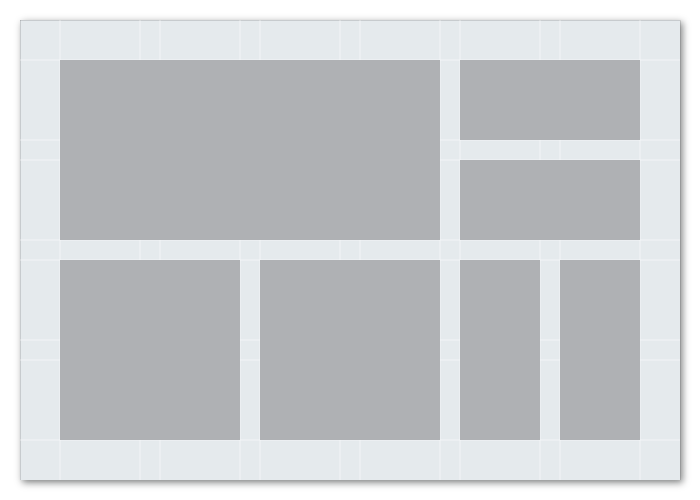
modules
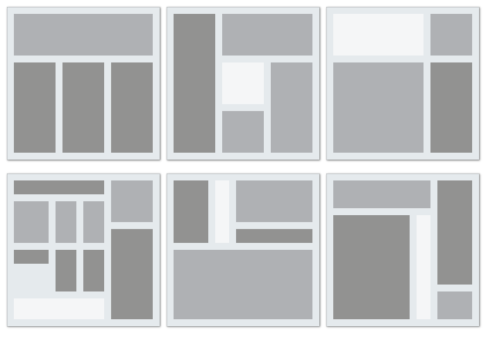
Modules are the building blocks of any grid. They are the spaces created between the flowlines and vertical lines. Vertical groups of modules together create columns. Horizontal groups create rows.
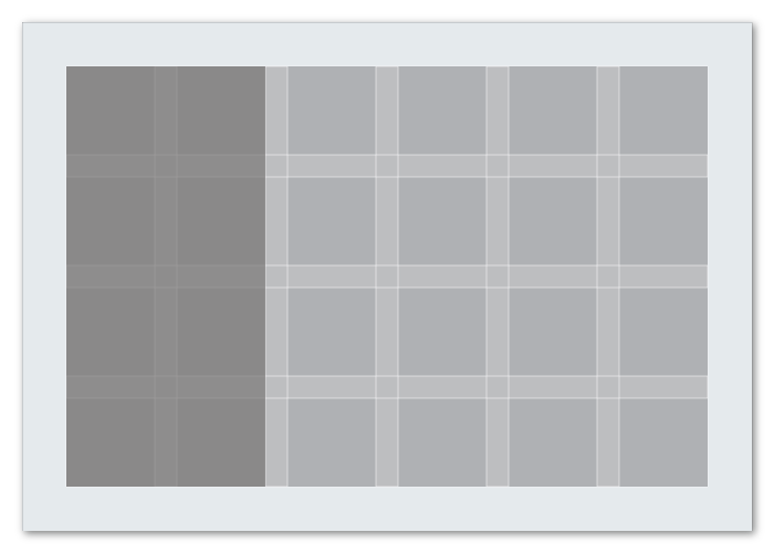
spatial zones and regions
Groups of adjacent modules in vertical and horizontal areas create spatial zones or regions. A vertical region can hold a block of text, a horizontal region can hold a video.
Regions can be organized proportionally or used to create overlapping zones.
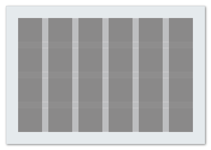
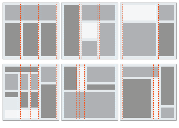
columns
Columns are vertical spatial zones or regions that fit fully from the top to the bottom margin.
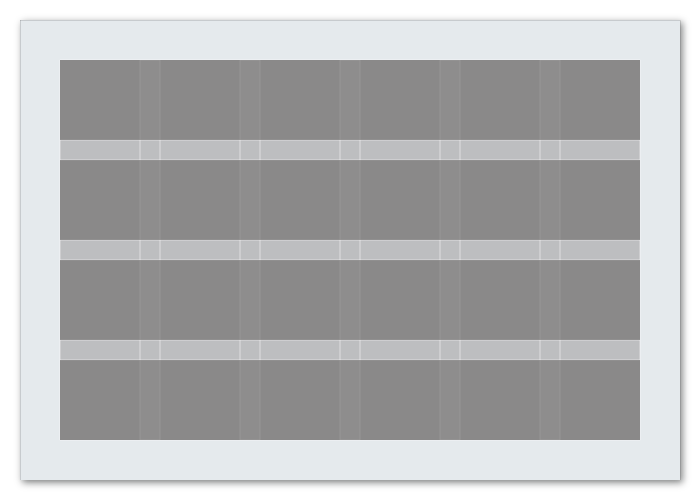
rows
Rows are horizontal spatial zones that fit fully from the left to right margin.
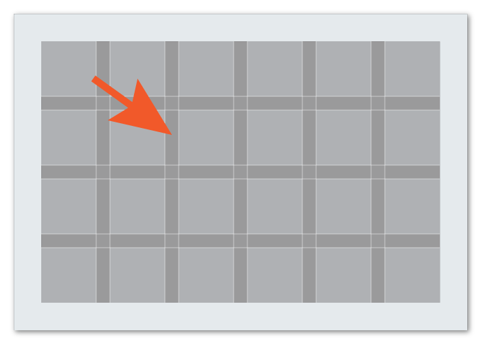
gutters
The spaces between rows and columns are called gutters. These should always be equal between columns or rows, in order to maintain a visual balance.
