by JuliannaKunstler.com
laws of visual perception
GESTALT principles
assignments
examples

closure
White (negative) space between the letters “U” and “A” form the letter S.
Figure/Ground principle is also used as "S" is a negative shape that becomes positive.


proximity
Our brain combines each of the adjacent horizontal bars to create a single image of the IBM logo.
This is why when we look at the IBM logo, we see three letters composed of short horizontal lines, stacked atop each other, instead of the 8 horizontal lines interspersed with uniform gaps.


proximity
Since all the miniature icons are clustered together, the resulting bunch easily reads as a “U” in the logo mark.


Figure/Ground
The hidden arrow in the FedEx logo is one of the most popular examples of the utilization of negative spaces.

continuity
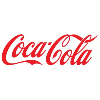
Our eyes follow from the C in Coca to Cola, continuing on from the C in Cola through to the L and A in the word.
This visual aid helps our eyes continue to move through the word!


closure
We close the gaps to complete the white shapes.


figure/ground
The lead "cutout" becomes a positive shape.


figure/ground
Negative white space reads as a positive shape.
Also, the principle of proximity is used as the two halves should be as particular distance to be read as a basketball player.


continuity, figure/ground, closure
The three principles are used.



Source: https://www.designspiration.net
similarity
Similar shapes are used to form a flower and a bee. The striped shape is a focal point as it it different from the rest of the shapes.
The three black shapes group together for a bee symbol.

assignment 1
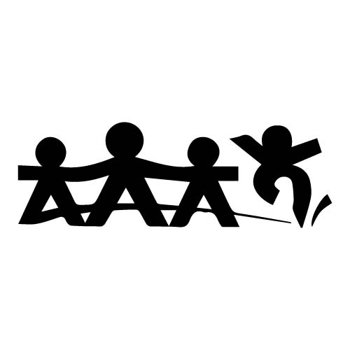
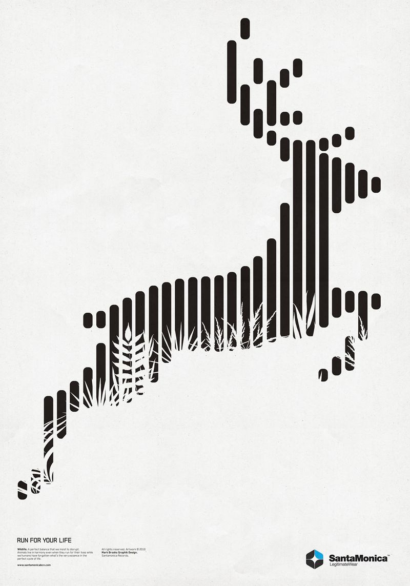
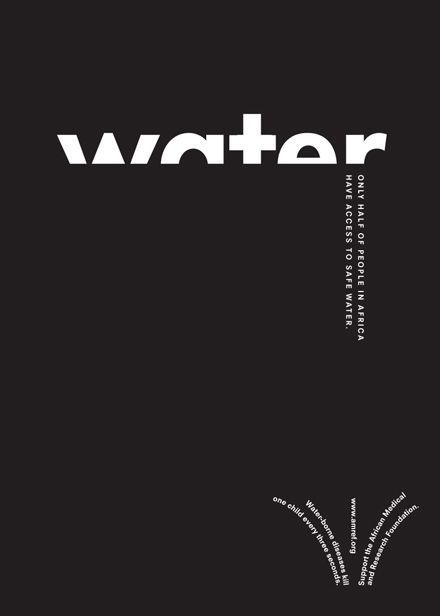
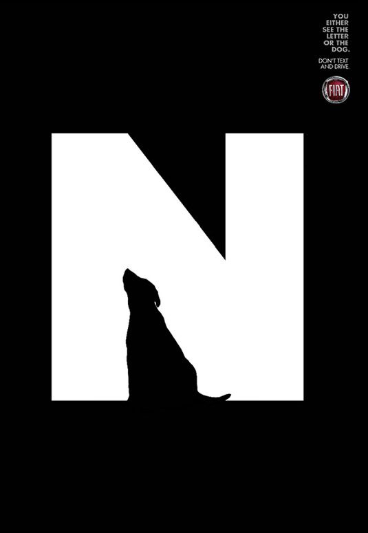
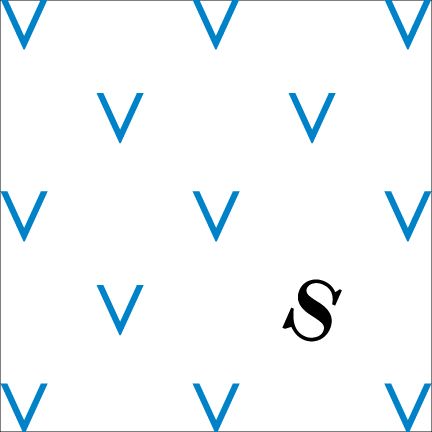
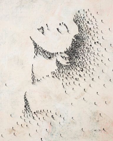
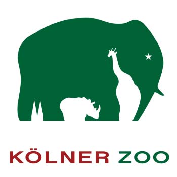
For each image below, explain what Gestalt principles were used.
1. State the principle
2. Explain how this principle is used in the design.
3. Is there more than one principle used? Explain.










assignment 2
Find a graphic image (logo, poster, book cover, etc.) that you find interesting.
Save it.
Explain what Gestalt principles did the designer use in this work.
