step 1
Download and open the work file.
Save it to your drive.
step 2
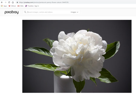
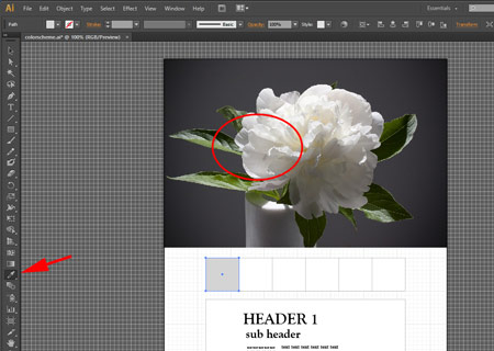
This is the most important step - finding a right photograph.
Use good quality photos from free stock photos libraries, like:
Pixabay
Pexels
Stockvault
Search for Nature photographs (fog, sunset, flowers, landscape, sky, water, etc.)
Your photo should be:
- is aesthetically pleasing
- fits the theme of your project
- you enjoy the harmony of the colors
Copy it (right-click and Copy).
step 3
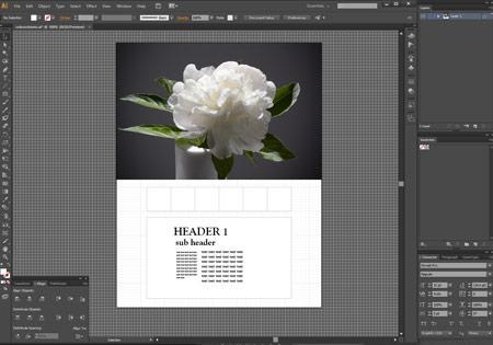
Paste the photo onto the work area.
Resize it if needed.
Use Selection tool.

step 4 - choosing colors
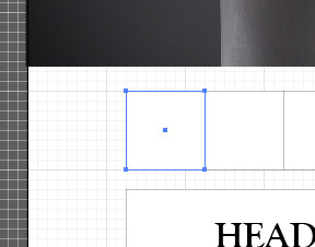
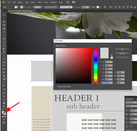
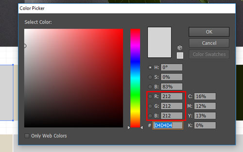
Select the first swatch square.
Use Direct Selection tool to select just one.

The swatches are grouped, so the only way to select just one square is to use Direct Selection tool.
Or you can ungroup the swatches (Object > Ungroup) an then use the Selection tool.
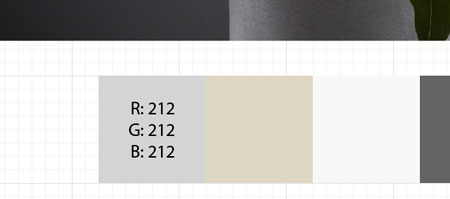
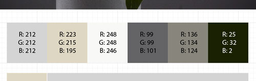
You are going to "sample" 6 colors that you will use in your next assignments.
Keep in mind that you will use these colors for backgrounds, headings, text, and graphics.
The 6 color swatches should include:
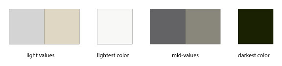
With the first swatch selected, choose Eyedropper tool.

Click anywhere in the image to select a color that you might like.
Most likely, you will re-select the colors a few times. That's fine. As long as they look in harmony.
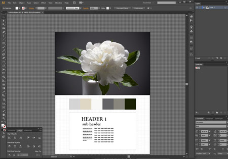
Experiment with colors.
Use your intuition to find the right colors for you.
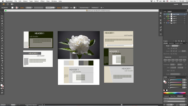
step 5
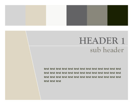
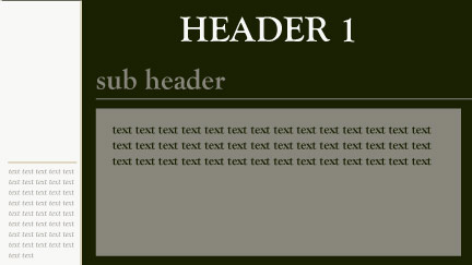
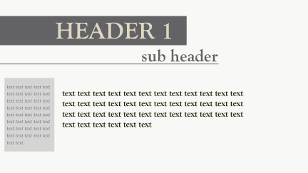
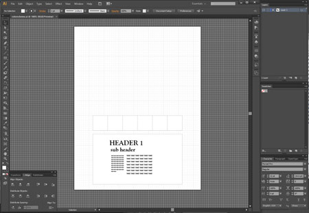
Now it's time to apply the color scheme in a layout setting.
You have a simple layout design of a slide. Use it to experiment with colors.
Try different variations of layouts and color combinations.
Try light backgrounds vs. light backgrounds, etc.
Experiment with text colors.
Add or modify extra shapes, lines, or graphics.
Be creative.
Duplicate the design and try different layouts.
Use work area outside the Art Board.
These designs will not get printed, but you choose the best color and layout combination for the final draft.