julianna kunstler logo
black squares

design problem
Instagram icon

by JuliannaKunstler.com

Here is a design problem for you that will help you to understand the language of graphic design.

It will allow you to express yourself using design principles to create visual communication.

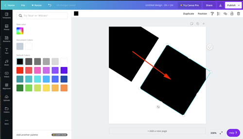
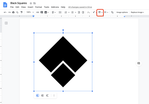
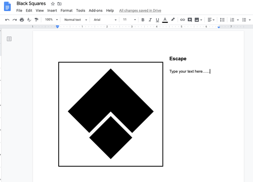
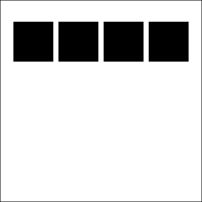
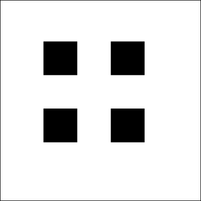
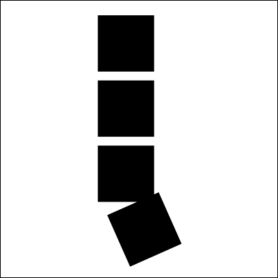
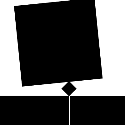
By using 4 black squares, create a graphic image that best expresses the meaning of each of the following words:

elegant, playful, violence, love

Using only 4 squares is a seemingly limited palette to express such diverse words yet the squares can be expanded into a more comprehensive language by utilizing design principles.

Things you cannot change:

  • number of squares (4)
  • color of the squares (black)
  • color of the background (white)

Things you can modify:
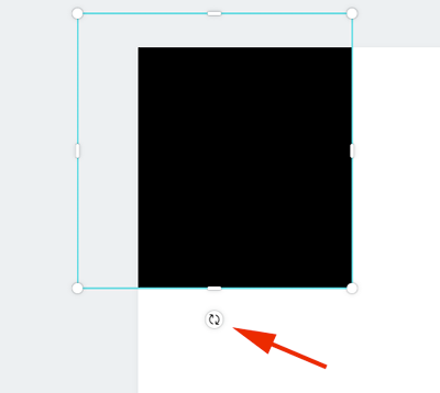
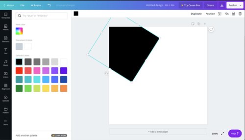
  • size
  • rotation
  • spacing
  • crop
  • overlap

Your steps:

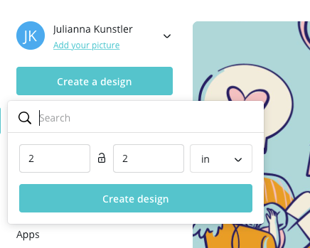
1. This assignment should be done in Adobe Illustrator or Canva. Experiment with the designs to find the best visual solution for each word.

2. Place all designs into a Google Doc

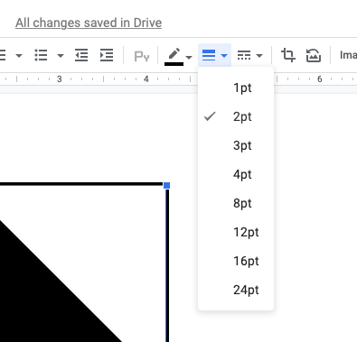
3. Add a black border around each image

4. Write a brief paragraph for each image - stating the word, that's been illustrated and why did you choose this particular design to illustrate it.


Below are some examples of a similar assignment.

examples

order

order

order

order

increase

increase

bold

bold

congested

tension

tension

tension

STEPS

Designing tips:

It is your task to design the most creative and visually interesting composition possible.

That means you need to arrange the squares in a way, that is pleasing to an eye. For example:

  • Use alignment of shapes (unless there is a specific need not to),
  • Balance the composition - symmetrical or asymmetrical balance - (unless there is a specific need not to),
  • Space elements with purpose
  • Utilize negative space (Figure / Ground principle) - for more interest
  • If there is a focal point - use Continuity principle to point/lead to it

In order to do this you must experiment with numerous compositional factors that automatically arise when shapes are arranged within a picture plane.

Design Considerations:

  • Avoid predictable and cliché arrangements where something is placed in the middle and then in each of the four corners.
  • We are dealing with balance, so visual weight is a consideration. Value, size and arrangement will all be factors in your composition. Remember you can rotate your shapes to change the weight.
  • Consider making curved or diagonal paths that the shapes can follow to create movement.
  • To avoid monotony by adding variety, change or vary the space between shapes. This will change the rhythm within the composition.
  • Be aware of the shapes orientation to the picture plane. It can be parallel with the edge, tilt or even go off the edge. This can create variety in the piece.
  • Touching the edges of two shapes to each other at odd angles can create tension.
  • Overlapping shapes can create the illusion of depth.

Please take your time experimenting with different layouts.

Below are the steps that you would take in Canva, but Illustrator steps would be very similar.

Create a new document in Canva.

Set the dimensions to "inches"

2" x 2"

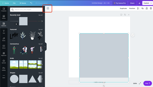
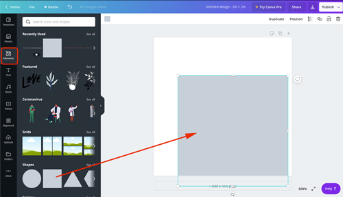
Drag a square onto art board.
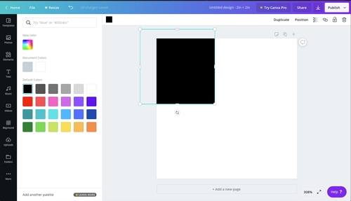
Open Color options.

Make your square black.

Resize it.

Make sure you are holding SHIFT key to keep it as a square!!!!

If you need to rotate the square - use the tool below the shape.

Duplicate the squares by Alt/Option dragging it.

When you are done with your design - download it as a PNG file (or JPEG of you want to)...

Then start working on the next design...

When you are ready to put the designs together - create a new Google Doc.

Insert image.

Then you need to add a black border around the image.

Pick the border weight: 1 pt or 2 pt.

Type the word that you illustrated.

Then a brief explanation of WHY you designed it this way...

Then repeat the steps for the rest of the designs.

Done!!!!

...