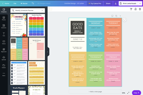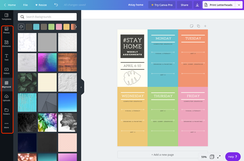
Start with selecting a template that you think you can adjust to your needs.
Remember, that everything here can be edited, moved, and deleted.
Colors, texts, fonts, etc...

Start with titles, and other general information.
Decide what you want to keep and modify, what you don't need at all, what can be changed.
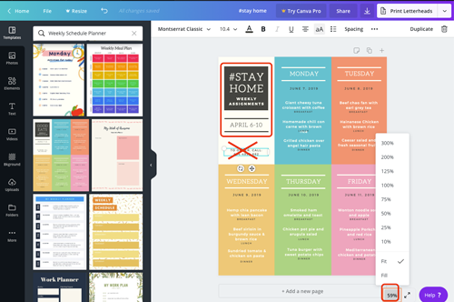
You can zoom in for better detail view.

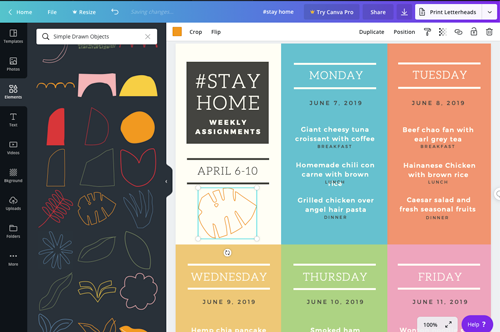
Replace template elements with your own graphics and text.
Be creative here.

As you change color for elements - utilize the Color Picker if you don't like pre-set swatches.

Delete all unnecessary template graphics and text boxes.
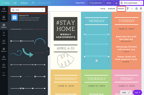
Divide the area into the number of classes you have on that day.
Dividers for classes can be lines, shapes, outlines, whatever will make sense in your particular design.
Always, always, always use grid layout approach - that is everything should be aligned to something in the design for a "put together" look.
You will see those smart guides as you move elements around.

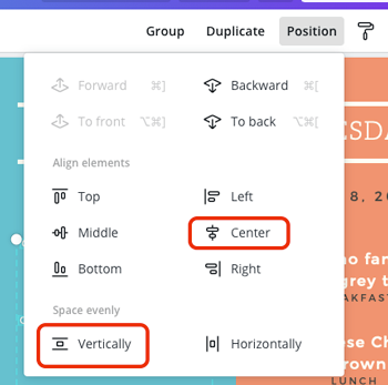
Also, make sure you align elements and space them evenly.

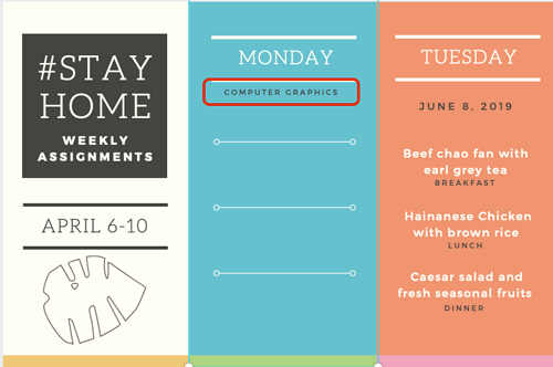
Add text for the class titles.
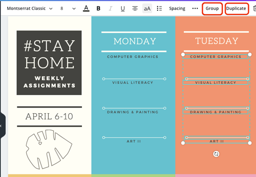
Then copy and paste to keep text formatting consistent.

Do not forget to align again.
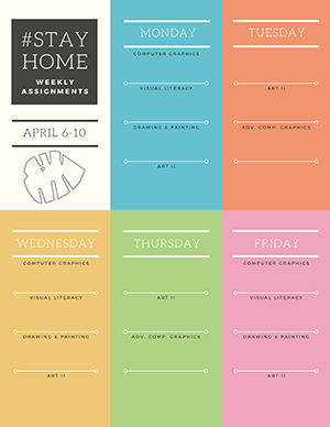
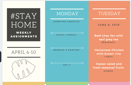
Now you have your first layout done.

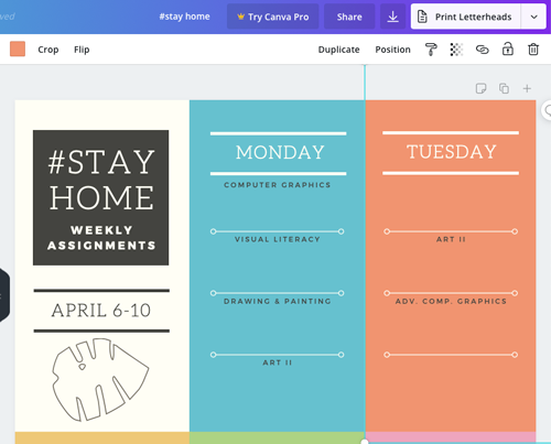
Group the elements, then duplicate the group.

Change class titles to your schedule.

