julianna kunstler logo
Business Card Design

Instagram icon

by JuliannaKunstler.com

Objectives:

Understand and apply the basic design process and objectives of designing a business card layout; solve the design problem by using typography, Principles of Design, and the personal logo; apply their previous knowledge of using Adobe Illustrator to create a graphic design.

Essential questions:

What should be on a business card?

What is the purpose of a business card?

What are the considerations while designing a card layout?

How to use Adobe Illustrator to create a logo?

before you start:

1. Have your logo created in Illustrator.

2. Have your 2-3 "brand" color swatches ready (or a brand color scheme). You brand colors should be part of your logo

3. Have all necessary contact information ready.

GALLERY

STEPS

How does a person, business, or organization adequately describe themselves in a 3.5 x 2 inch space?

Shape and size

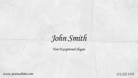
Business cards come in all shapes and styles.

They can be fun, creative, traditional, or, sometimes, weird. But they all have one thing in common - they should contain your contact information.

Your choices are:

  • Traditional rectangular card
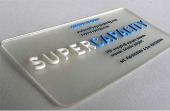
  • Rectangle with rounded corners for a friendly feel
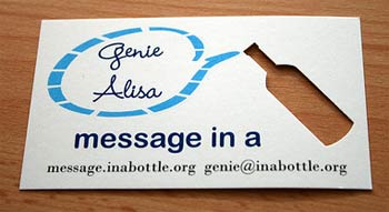
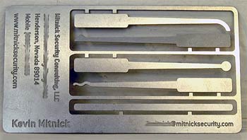
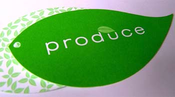
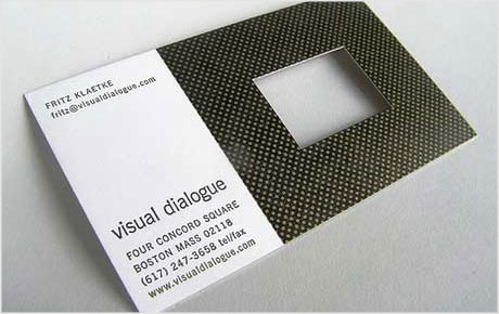
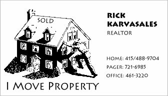
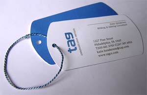
  • Any shape (mascot, outline of a product, or any other shape). This option (die-cutting technique) is more costly than others.
    The die-cutting technique can be also used with a rectangular card by cutting out an area inside the card.

Standard business card in US is 3.5" x 2" (Europe: 85mm x 55mm)

Consider 3 factors when designing:

  • Bleed area - area outside cutting line
  • Trim line - the target cutting line
  • Safety line - anything outside this line is subject to cutting mistakes

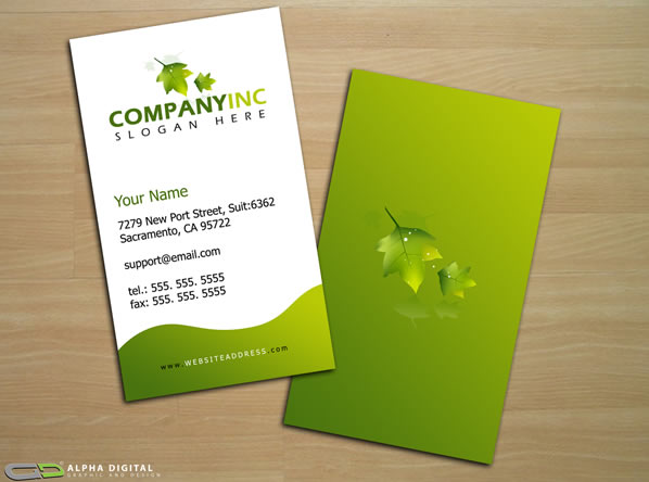
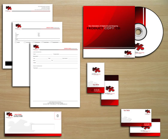
Logo and other graphics

Place and resize your logo.

Do you need any secondary graphics? Why do you need them? The correct answers would be:

  • to balance the layout
  • to emphasize what's important
  • to divide
  • to support

Remember, you communicate your brand personality through visuals.

Add text

The goal of a business card is to make it easy for someone to reach you, not difficult.
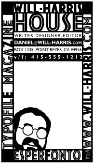

1. Your name.
2. Company name
3. Your job title.
4. A phone number (or two, fax, etc).
5. Social media
6. Mailing address / office address.
7. E-mail address (never use a "cutsie" email like "prettyface1234567@email.com, use your name instead).
8. The URL of your website.
9. Slogan, QR code, etc.

Typography

Once you know what you want to communicate - you can choose how it looks.

Consider:

  • font typeface
  • font size
  • font color
  • fonts pairing (check here)

Layout

Cards should have a pleasing layout, easy to reach and gather info. Use the following:

  • Grouping of like information
  • Readable text
  • Only 1 or 2 fonts
  • Negative space- the space around the text and logo should set off the contents of the card.
  • Symmetry or Balance so that the card does not look weighted on one side or another.
  • Alignment of elements

What makes a business card effective? Is it originality? Legibility? Simplicity?
Perhaps it’s how your card prompts the recipient into contacting you.

A clean, uncluttered design shows that you care about appearance and immediately sends out a professional vibe.

First and foremost, your card must clearly show your contact details. That’s the number one priority. Even if your card is poorly designed, it must allow people to contact you. Kind of a no-brainer, but you’d be surprised how many cards hide the contact info away behind some over-indulged color scheme or illegible typeface.

Regardless how flashy or clever your card is, if contact information is not readily available, or quickly processed, the card failed.

What does it matter if someone remembered some neat trick the card does or how nice it looked if they find a hint of difficulty acquiring your information

...