Requirements:
- document size 8.5" x 11"
- use: Illustrator and Photoshop
- should include text:
Wilmot Union High school
Home of Panthers
2013-2014
Athletic program
- School logo or part of it
- Should include colors: red and black
- Images: photos (Photoshopped) or vector
- Grid layout design (elements need to be aligned)
- Appropriate fonts (not more that 3)
|
Downloads:
Wilmot LOGO
Wilmot photos
|
Create a cover for next school year Athletic program.
Start with sketching. Use thumbnails or full size paper for sketching. Research cool booklet cover designs. Do not copy someone's design, but you can use ideas to adopt and apply to your task.
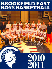
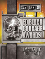
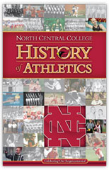
Below are some examples of cover designs:
Steps:
1. Sketch!
Let me see your sketches. You should have at least 10 sketches (approved by me) before we choose the best idea (or a combined idea).
Layout
A layout is the arrangement of type and art (photos, illustrations or any other graphics) on paper (or web site).
There are three criteria for a good layout:
- it works - for a layout to work, it must get your message across quickly and appropriately
- it organizes - content should be well organized and user-friendly so the reader can move smoothly and easily through the piece
- it attracts viewers - layout should stand out from its competition in order to attract
When you are looking at a design piece, your eyes should be drawn through it in a way that provides you with relevant information almost instantly.
Effective design will assist you in being informed without being overwhelmed. A good designer knows this, and consciously places information and design elements where they need to be.
Here’s how to tell if a good designer has been at work on the layout you’re looking at:
- Your eyes are naturally drawn to the most important or most interesting part.
- You are able to scan the piece and understand what it means, without having to backtrack or scrutinize it for hidden meaning (unless that’s the point).
- The key information is easy to find, and easy to read.
- Important items are larger, while less important details take up less space.
- There are no needlessly distracting elements on the page.
- Good layout is carefully engineered for usability and readability and will be easy to interact with. Bad layout is tedious and disorganized.
Grid layout - design is based on a grid structure where all elements are aligned. Before placing an element - think WHY you are placing it here. No random placements unless it is a single item and it is a focal point of the composition.
2. Images
Select one or multiple images. If they are photographs - they need to be good quality pictures.
You can also use vector graphics (geometrical shapes, symbols or vector images).
Place all images into one folder.
Use Photoshop to edit images.
3. Text
Choose your fonts carefully. Nothing too fancy.... no more than 3 fonts in one design. Black and white color works with any design. If you want to add color to a font - use a color picker to sample color from your image or use any of the color schemes to work with your design.
4. Putting it all together.
Use Illustrator. Document size: Letter (8.5" x 11"). Units: inches
Turn on the grid view (View>Show Grid). I recommend the following settings for the grid:
Illustrator>Preferences>Guides & Grid
Gridline: every 1 inch
Subdivisions: 4
Place images onto one layer and lock it. Add all text and other graphics on a new layer.
5. Let me see your design before you print it out.
6. After the design is done:
- Print one copy
- Save your file as PDF. Email it to me.
The winner will be chosen in June! |