julianna kunstler logo
observational coffee painting

tile relief
Instagram icon

by JuliannaKunstler.com

Painting with coffee. Observational drawing followed by coffee washes.

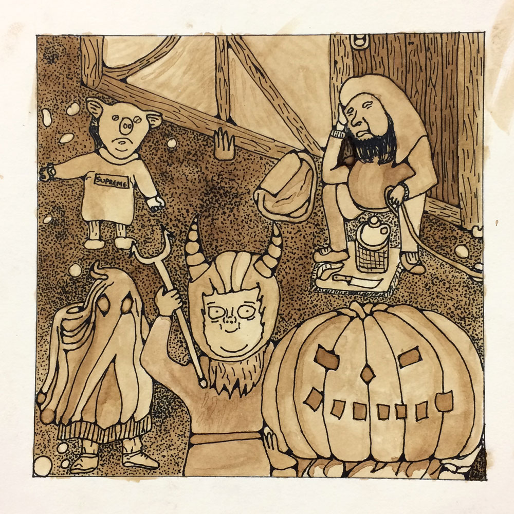
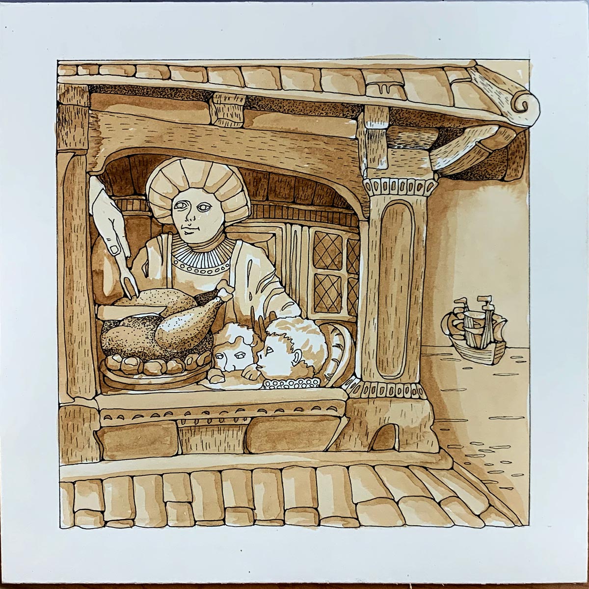
Grisaille (from French: gris - grey, [ɡri.zai]) is a term for painting executed entirely in monochromatic color scheme, usually in shades of grey or brown

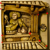
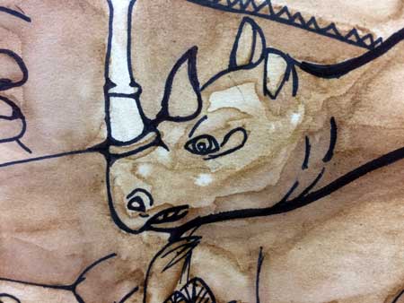
For this assignment you are going to draw and paint a relief tile by looking at it.


Observational drawing is extremely important in your drawing learning process.


WI State Standards:

  • AA Cr11h
    Plan: Formulate original concepts by practice, experimentation, and revision. (planning/experimentation)
  • AA Cr12h
    Make: Create works of art that introduce students to media, care of tools, and basic craftsmanship skills.
    (skills)
  • AA Pr10h
    Develop Meaning: Curate a body of work incorporating personal, historical and contemporary art to communicate one or more points of view.
    (aesthetics / communication)

Learning objectives:

  • observational drawing
  • proportions
  • shape placement/size relationship
  • linear drawing
  • stylizing a drawing
  • implied texture
  • concept of washes
  • building up value with layers
  • show depth in a painting
coffee painting

in a nutshell:

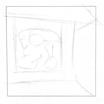
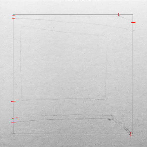
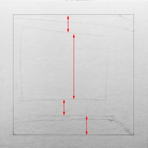
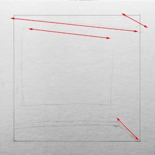
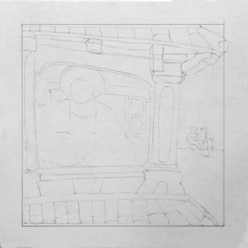
1. Standard AA Cr11h (planning/experimentation): Start with sketching. Analyze the shapes and lay them out.

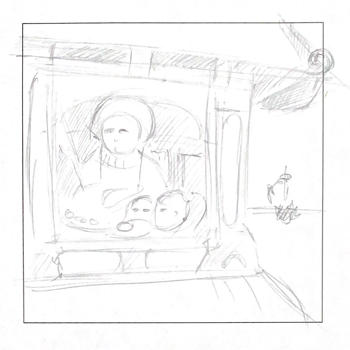
2. Standards AA Cr12h (skills) & AA Pr10h (aesthetics/communication): Then let's focus on the drawing: proportions, attention to details, quality of lines.

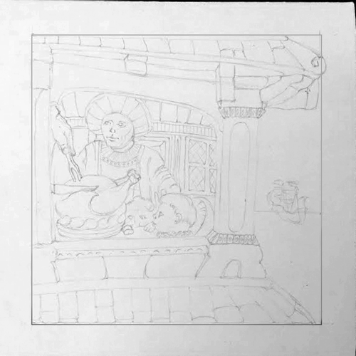
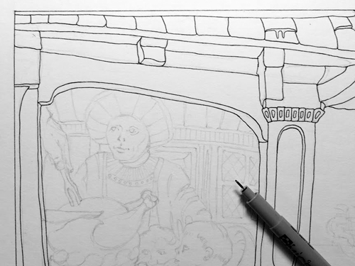
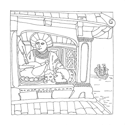
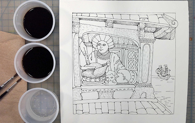
Do a line drawing using regular pencil, drawing lightly so that you can easily erase. Take your time with this step.

Start with laying out all major shapes. Make sure they are proportional to each other and the board itself. Then draw in all the details...

The better your drawing is, the better your finished painting will be.
Do not create values (do not shade!!!)

Show darks and lights by drawing them as shapes without shading them in. You can also show different colors the same way. Draw the different colored shapes, but don't shade them in

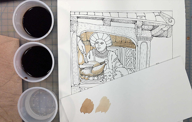
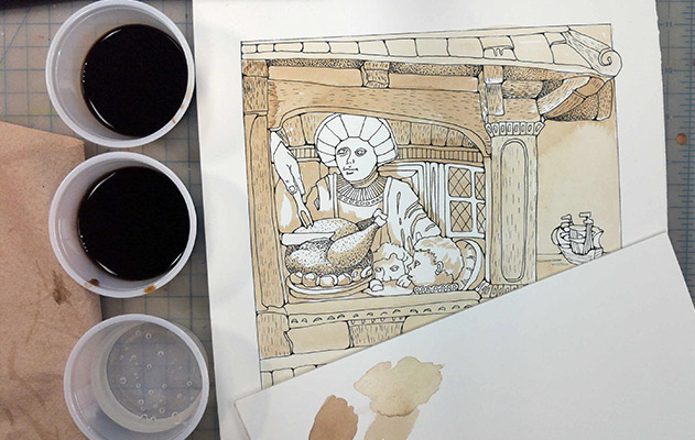
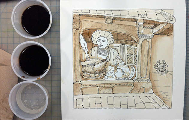
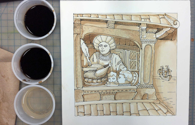
3. Standards AA Cr11h (planning/experimentation) & AAPr10h (aesthetics/communication): Then you will paint the tile with coffee by applying values as washes (watercolor technique). Washes will build up values.

Make sure you paint multiple values that create an illusion of depth.

Any cheap coffee will work for this painting. You need to make a strong one to achieve darker values.

I found that INSTANT COFFEE (that tastes nasty) works best as it dissolves perfectly and does not leave any particles behind.

examples:

STEPS

pick a tile

Choose a tile from the choices that are available. Choose the one that truly interests you, one that intrigues you by its interesting subject matter, or by its composition. Please don't simply choose one that you think is "easy".

The complexity of the tile is a part of your grade.

sketching

standard AA Cr11h (planning/experimentation)

The first step to any art project is developing an idea and deciding on the composition.

This is an observational drawing, so we already have a composition established for us, but your task is to recreate it within the designated area. The only way to learn how to copy from observation is to analyze the forms/shapes and place them proportionally.

That is the reason we need a sketch.

Use worksheet that has exact dimensions as the tile. That will help you with the proportions. (The final drawing will be exactly double the size).

Start sketching the big shapes (or groups of shapes) first. Use the same approach as we did in a grid drawing - look for key points.

Make sure all big shapes are there before adding details.

Use your sketch as a reference for laying out the final composition.

drawing

standard AA Cr12h (skills)
standard AA Pr10h (aesthetics/communication)

On your board:

Draw a 1" border.

Look at the tile and your sketch.

Mark all key points that will help you place the layout of the scene.

Start with the perimeter of the tile.

Remember?.... grid drawing technique...

Check and compare all major proportions of the main areas.

It is also helpful to find the center of the tile and the drawing.

You can use it as a reference point.

Don't forget to check and compare all heights.

Use your pencil to find all major angles in the layout.

Align your pencil with a shape edge and transfer it onto your board.

The lines should match with your key points.

It's like solving a puzzle!!! Fun!

Now break the big shapes into smaller parts.

Start adding smaller details.

Make sure you have every detail.

Look at the tile and decide on where and what kind of texture you will have to add to your drawing.

At this point your drawing is a light, clean linear drawing with no shading.

Outline your design with a fine permanent marker.

Use smooth solid lines.

Erase all pencil lines.

Stylize the corners in the drawing for added effect.

You can skip the small shapes though...

Copy texture that you see on the tile.

Use pointillism or/and other types of strokes.

Click on this image to zoom in and see details.

Be very accurate with proportions, placement of shapes, and details.

Let me see your drawing before you go to the next step.

painting

standard AA Cr11h (planning/experimentation)
standard AA Pr10h (aesthetics/communication)
coffee painting

Paint the piece using coffee.

You will dilute instant coffee granules into water to create a "wash". You will use the wash to paint the variety of values. Follow the darks and lights in the tile as accurately as possible, translating these values into browns and sepia tones using coffee as your "paint".

Shapes touching each other should not be the same brown value.

Trace your design with a Sharpie again.

Don't lick your painting !!!!!

drawing

Premix few washes that you are going to use for more delicate positive space.

Make light and medium washes.

Use flat and round watercolor brushes.

Don't forget to use paper towel to remove excess coffee from your brush as you paint.

Find the darkest areas and paint them first.

Be patient and let the washes dry.

Each additional layer (or coat) of coffee - darkens the area.


Optional: you can use masking/painter tape around the perimeter of the drawing before you paint to protect the border.

Have a cup with strong/medium coffee;

Another cut with a diluted one - for lighter values;

And a cup of water.

Also, grab a scrap piece of an illustration board to try and preview the washes.

Apply the first wash all over the tile drawing.

Just skip the lightest areas and/or highlights.

Continue building up values.

Make sure one layer is dry before you apply the next.

Do not focus on one detail at a time.

Work on darkest areas first. While each wash is drying - you can paint other areas.

When it seems that your painting is done - analyze it and compare to the tile.

Most likely you will notice that you will need to add contrast and emphasize shadows.

Now you can focus on details and textures.

But continue adding more depth.

This is what 3-D effect looks like - you have multiple values within one shape.

In these examples - look at value variations within shapes.

Continue painting until you are satisfied with it!

Have fun!

GRADING

WI standards Grading Rubric
standard no evidence beginning emerging proficient advanced

Cr.11

planning / experimentation

(sketching, developing personal style, tile complexity, experimental coffee painting)

Assignment is missing, or does not show enough evidence, work is not complete and/or does not show the process from specified instructions

Steps were not followed.

No evidence of careful planning.

Simple reference tile

Limited painted values

Detailed reference tile

Preliminary sketching

Does not demonstrate effort and attention to details.

Line stylizing is limited

Not enough values painted

Complex reference tile.

•Multiple sketches were done or the initial sketch is very detailed and intricate

Artwork demonstrates accurate planning, effort, attention to details.

Comprehensive sketch

All lines are stylized

Variety of values

Student displayed an outstanding effort in regards to application and understanding of the content.

Artwork shows individual style, careful planning, multiple revisions and attention to details.

Design is intricate and creative. The piece exhibits evidence of creative experimentation beyond the required task.

Wide range of values painted

Cr.12

skills

(proportions, line drawing, texture, washes, craftsmanship)

Assignment does not show enough evidence or is missing

Student somewhat followed the process.

Some steps are skipped or incomplete.

Linear drawing requires major improvement

Painting is not done or does not fulfill the requirements

Artwork is messy

Proportions are not accurate

Work requires major improvement.

Student mostly followed the process.

Work shows some skills and basic/partial understanding of the process.

Most details are drawn.

Drawing is not detailed

Work needs improvement and does not meet all requirements

Proportions are not accurate

Student followed the process exactly as the instructions specified.

Work shows proper use of skills and techniques

Every drawing step is carefully performed. Texture is added.

Painting technique is accurate, all requirements are met (layers/washes, value variety, careful painting)

Accurate placement of shapes, accurate proportions.


Student followed the process exactly as the instructions specified and, in addition

Painting skills show additional effort and creativity

Craftsmanship and attention to details are flawless

Accurate proportions.

Pr.10h

aesthetics / communication

(illusion of depth, personal involvement)

Work is not complete and/or does not show the process from specified instructions or there is no evidence or is missing

The artwork communicates little effort and personal emotional involvement in the process.

Project is not finished

No illusion of depth

Student attempted to follow the directions.

Project does not show enough creativity and effort

Multiple values are used in the painting, but lacking an illusion of depth

Some areas need improvement.

Artwork shows individuality and effort.

The artwork displays a clear meaning and style of the assignment.

Shapes next to each other are not the same brown value, values support the illusion of depth.

Craftsmanship is good

Student went above and beyond in the use of Art Elements and Principles to convey a clear message, showed understanding of the task, and solved the task in the most creative way.

Artwork shows individuality and emotion involvement.

Artwork is intricate.

Variety of values and textures support the illusion of depth

coffee painting lesson