color schemes in graphic design
classic and intuitive approaches
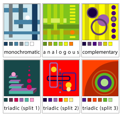
In color theory, a color scheme is the choice of colors used in design for a range of media. Color schemes are used to create style and appeal.
When choosing a color scheme - think of what a message you want to convey with your artwork, your target audience, the theme of your artwork, do you want to emphasize anything..... Think of how many colors do you need.
STEPS
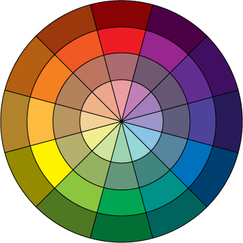
Assignment 1. Classic Color schemes.
Open Adobe Illustrator.
Create 6 abstract designs (using geometric shapes) for each color scheme:
- Use at least 6 shapes for each design.
- Include color swatches below each design.
- Include the name of the scheme (use color wheel above for reference)
Use this link to select colors.
Assignment 2. Intuitive Color Schemes.

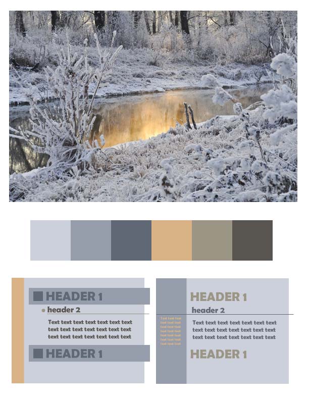
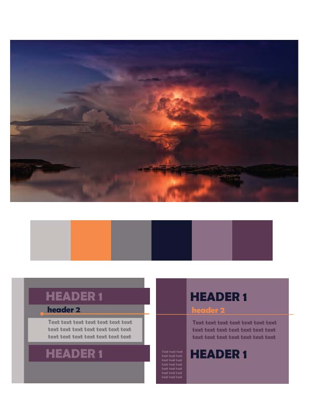
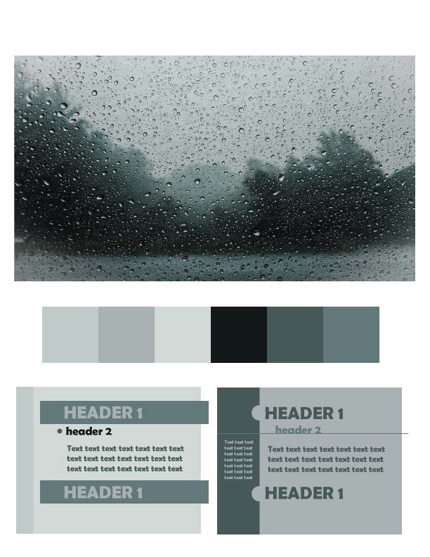
Find a photograph that:
- is aesthetically pleasing
- fits the theme of your project
- you enjoy the harmony of the colors
Copy it.
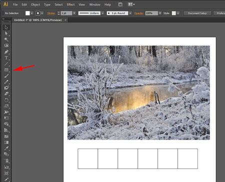
Create a new file in Adobe Illustrator.
Paste the image.
Create 5 - 6 squares to keep the color swatches.
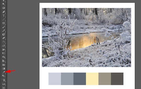
Use Eye Dropper tool and select colors that you feel will look good in your project.
You should have both dark and light colors to maintain some contrast in your work.
Please include:
- One "pop" color
- Two dark colors
- One medium-tone color
- Two light colors
These colors are not final - you might need to tweak them in the next step.
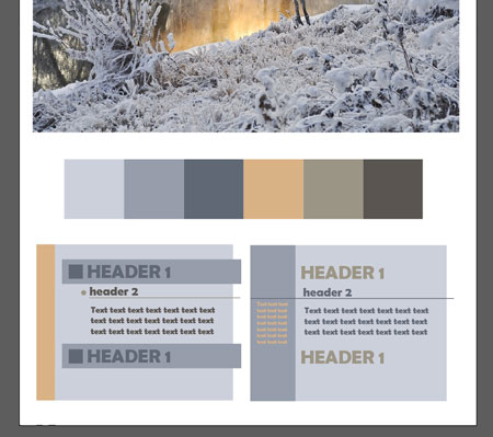
Create at least two variations of the color scheme use for a document layout
- Choose a background color (or two)
- Header 1 and header 2
- Body text color
- Additional text color
- Other graphics (lines, shapes, etc)
...