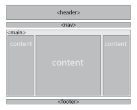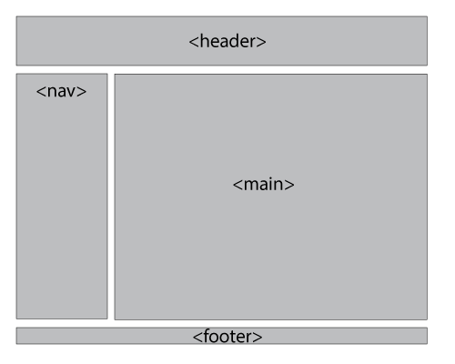
Before you start your design - you need to decide of where and how do you want to use the layout containers.
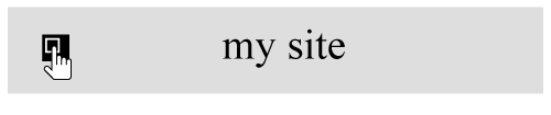
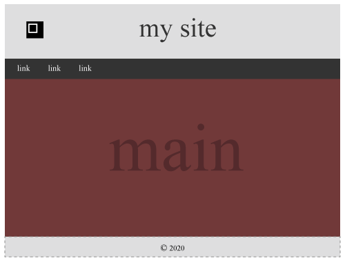
header
Let's start with the header. This is where you will write the title of your page or site, place a logo, or just an image...
in HTML code:
Right below the <body> tag

<header>my site</header>
in CSS:
header {
background-color: #DEDDDD;
text-align: center;
padding: 30px;
font-size: 3em;
color: #333333;
}
background-color - is a color of the header container (the box);
text-align - obviously - text alignment;
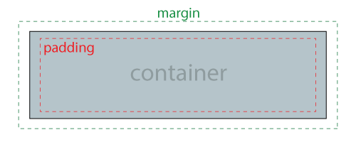
padding - space around the content inside the container. 30 pixels value means that there are 30 pixels around the content on all 4 sides.
font-size - use em units - 1em=your default text size; 3em=three times the default text size
color - refers to text color inside this container.
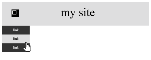
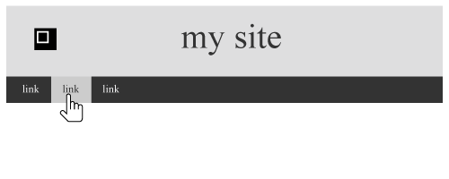
navigation bar
vertical
in HTML code:
after the header tag.

<nav>
<ul>
<li><a href="#">link</a></li>
<li><a href="#">link</a></li>
<li><a href="#">link</a></li>
</ul>
</nav>
<ul> - unordered list (the one with bullets).
<li> - list item - your link-button
<a href="#"> - specifies link target
in CSS:
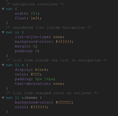
/* navigation container */
nav {
width: 20%;
float: left;
}
/* unordered list inside navigation */
nav ul {
list-style-type: none;
background-color: #333333;
margin: 0;
padding: 0;
}
/* list item inside the list in navigation */
nav li a {
display: block;
color: #CCC;
padding: 8px 16px;
text-decoration: none;
}
/* list item changed color on rollover */
nav li a:hover {
background-color: #CCCCCC;
color: #333333;
}
/* - you can add your notes to the code */
the nav container:
width - specifies the width of your navigation container. Can be in pixels or %.
float - property is used for positioning and formatting content
unordered list:
list-style-type: none; - removes the list formatting (bullets)
background-color - obviously
margin: 0; padding: 0; - to remove browser default settings
list items that are links:
display: block; - Displaying the links as block elements makes the whole link area clickable (not just the text), and it allows us to specify the width (and padding, margin, height, etc. if you want)
color - text color
padding: 8px 16px; - sets padding top and bottom to 8 pixels, and left and right - to 16.
text-decoration: none - removes default link underline formatting.
rollover settings:
background-color - changes as you roll over the button
color - text color changes as well
horizontal
in CSS:
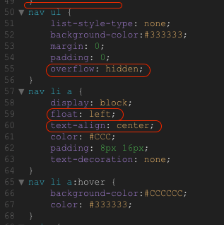
nav ul {
list-style-type: none;
background-color:#333333;
margin: 0;
padding: 0;
overflow: hidden;
}
nav li a {
display: block;
float: left;
text-align: center;
color: #CCC;
padding: 8px 16px;
text-decoration: none;
}
nav li a:hover {
background-color:#CCCCCC;
color: #333333;
}
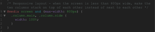
Here are some changes you need to make to the code to convert the vertical menu into horizontal.
nav - you can remove the nav tag unless you want to specify its parameters.
unordered list
add overflow property - it tells whether to clip the content or add scroll bars when the content is too big to fit in the area.
list item
float: left; - will position the list items in line
text-align: center; - to center text inside the list item box.
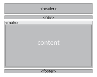
the main content container
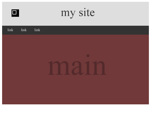
in HTML code:
after the nav tag.

<main>
</main>
Leave the content empty for now. We will return here shortly.
in CSS:
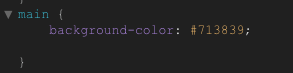
main {
background-color: #713839;
}
Just add some weird background color so you can see the container.
You will probably change it later anyway.
footer
in HTML code:
after the main tag.

<footer>© 2020</footer>
where © is the copyright symbol © and 2020 is just a year.
in CSS:
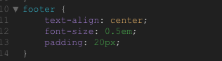
footer {
text-align: center;
font-size: 0.5em;
padding: 20px;
}
text-align - to center the content
font-size: 0.5em; - half of default font size
padding - for extra cushion around the content
