by JuliannaKunstler.com
GALLERY
STEPS
Focal point
 |
Determine which object will be your focal point. It can be different from the rest of the objects in color, material, amount of details, size, or the significance of the object. Be careful when adding a light source in your composition (sun, moon, etc.) as they draw attention to themselves. |
Movement
 |
Create a flow - move viewers' eye through the composition by leading lines (they are lines and shapes, edges, etc. that point to the focal point or draw eyes through the composition), value/color accents, contrasts, details (eye is drawn to details since there is nothing to look at in an empty space - eg.: simplify the background to draw attention to the subject), etc. |
Balance
 |
Balance the composition. Larger, darker, and more complex shapes have more visual weight. You can balance:
|
Repetition / Rhythm
 |
Elements in a composition can be repeated many times to create rhythm and movement. The repeated elements guide viewer's eye through the scene. RHYTHM refers to how quickly viewer's eye travels through the scene. If there is an area with little or no details or interest - the eye passes through this area without stopping. If there is plenty of details to look at - the eye will follow them to study - thus - slowing down.
|
Leading lines
 |
One of the things that make a good and dynamic composition is to direct attention to the subject. This can be done with good lighting, muted backgrounds, or graphic design. An important design element that directs our attention into the heart of a picture is called leading lines. These linse can take many forms. When we look at a scene - our eye is naturally drawn along lines. By using lines and repeating shapes in a composition, you create a rhythmic flow, movement, and guide the viewer through the scene. |
Visual triangle
 |
When we view a picture, our eyes travel from left to right and we typically begin viewing an image at the bottom left and then move upward and to the right. With this in mind, many works of art are composed in a triangular manner that is meant to draw our eyes to an area of focus within a subtle triangle shape. Having the base of the triangle at the bottom and apex at the top of the scene make the triangle appear very stable, much like a pyramid. When you start to change the angles inside the triangle and change the rotation of the triangle, the scene starts to appear less stable. |
Rule of thirds
 |
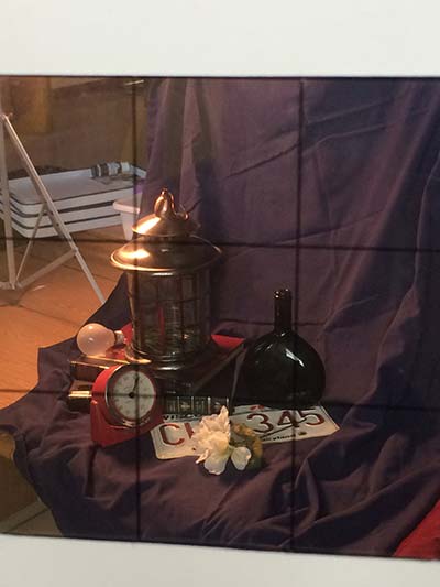
Perhaps the most well known principle of photographic composition is the "Rule of Thirds". The principle behind this rule is to imagine breaking an image into thirds. There are four important parts of the image that you should consider placing points of interest in - the intersections of the grid lines It also gives you four lines that are also useful positions for elements in your photo. You should position the most important elements in your scene along these lines:
|
Composition: what to avoid

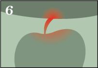
Cutting off shapes |
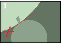
Halved shapes |
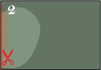
Edges go through the same point |
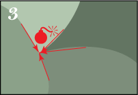
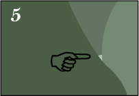
Fused edges and shapes |
 |
 |
 |
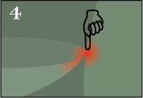 |
| Do not cut shapes at the weakest point (the narrowest point, etc.) - that places too much emphasis on the "cut-off" shape. | When a symmetrical shape is cut in half by the edge of the painting it creates an uncomfortable, chopped-off feeling for the viewer. | Move one of the shapes away. Multiple shape edges, that go to the same point - turn into leading lines and point viewer's attantion to an unimportant area of the scene. | Thre touching point create tension. Move objects apart or overlap. |
Overlapping shapes leave a tiny spot |
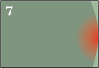
Two shapes touching the edges |
Fused shape and picture edge |
Closed corner |
 |
 |
 |
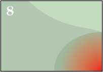 |
| This tiny spot attracts unnecessary attention. Overlap the shapes to get rid of it. | The edges of the objects create uncomfortable feeling and tension. Leave note space between the shapes or overlap them. | When the edge of an object touches the edge of your painting it can create an awkward, crowded sensation for the viewer. Overlap your objects or put some space between them. | If a shape completely covers a corner of the composition - it isolates this corner from the rest of the composition. You can soften the contrast between the shape and the background, so that it does not pull too much attention to itself. Bring the entire shape inside the picture plane or crop the image somewhere other than the halfway point. |
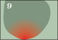
Sitting on the edge |
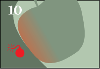
"Stolen" edge |
||
 |
 |
||
| Same as #7 - Move the object away from the edge (or crop it if necessary). Be careful when cropping though. | When the edge of one shape aligns perfectly with the edge of a second shape, it creates an ambiguous edge for both. Just move one of the objects to avoid the alignment. |
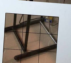
Composition: viewfinder
 |
|
 |
|
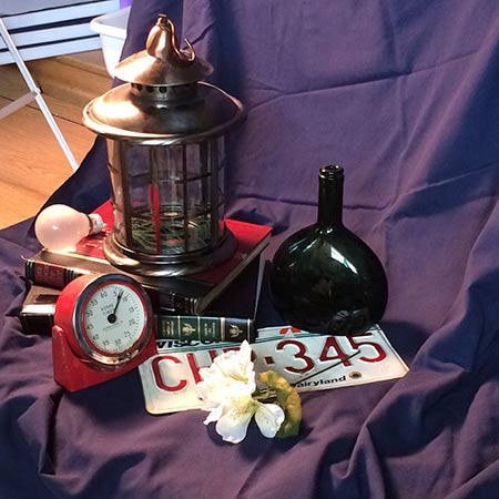
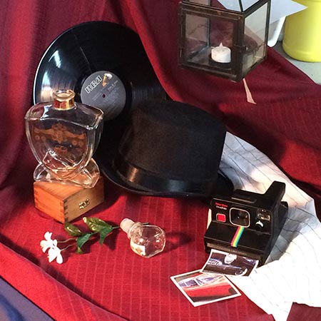
Setting up a still life
 |
 |
Resources and credits: emptyeasel.com, fox-orian.deviantart.com, ehow.com


