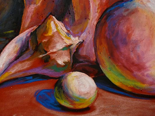
materials

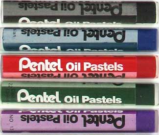
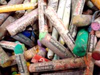
Oil pastels come in many colors and are made by different manufacturers. Try different brands to find the type that works for you.
Always get some extra white, tan or grey colors as they are often used to blend with other colors (to lighten the color or to dull it down).
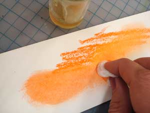
Use paper stumps or blending brushes to mix colors.
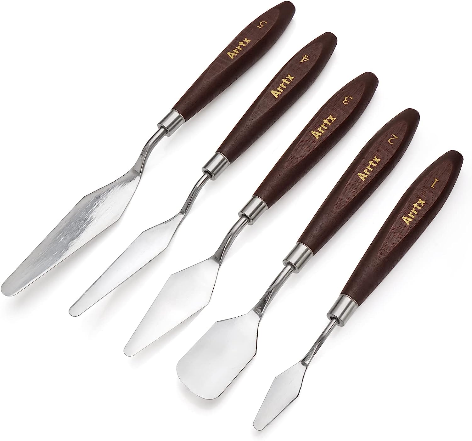
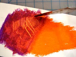
Use palette knife to scratch off oil pastels.
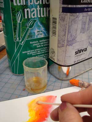
Have some turpentine or baby oil ready for a painting effect.
working with oil pastels
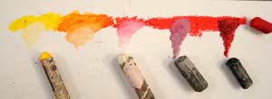
You can mix pastels to achieve the right shade by drawing with one color over another color in circular motion.
Use white, grey, or black pastels to change the value of a color and its brightness.
Usually use lighter color over darker one. (Darker color should be applied lightly).

Use the tip of the pastel for more intense coloring or a side - for larger areas.
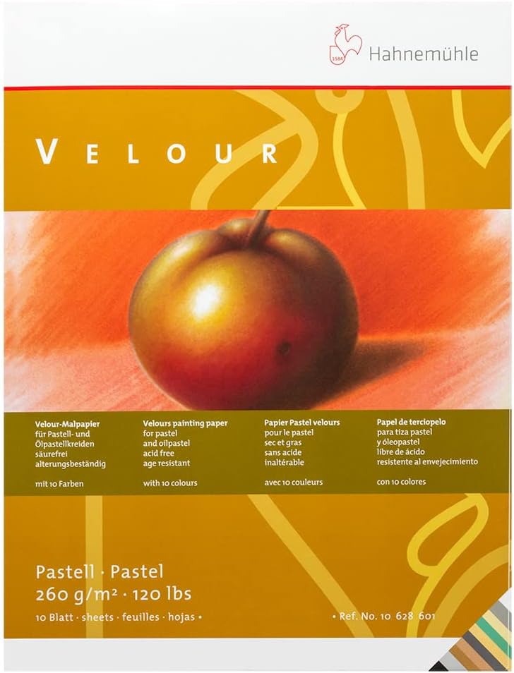
Try to work on a velour paper - especially colored one - you will like the result!
Prepare the color sets.
The colors below are approximate - your colors will depend on the color of your paper and your color scheme.
main color

Color of the paper (to correct mistakes)
mid-values
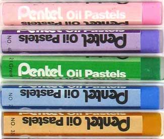
lights and highlights
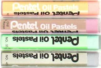
Lights - for lit areas.
The tints do not have to match the actual objects' colors or the color of your paper.

White - for highlights
darks
Dark values - for shadows and shaded areas
practice
Practice color value scales

Experiment with pressure

Blending colors

practice first
Worksheet


Color carefully around the edges.
1. lightly color with main color, use WHITE to blend
2. pure color
3. lightly color with main
color, blend with GREY
4. lightly color with BLACK, blend with main color

Use this exercise to see the difference of the resulting color when you alter the order of pastels.
1. Color in with WHITE pastel, then use a color pastel and color over, mixing and blending the colors.
2. Color in with your main color (from intense coloring at the top to fading at the bottom). Use White pastel and color over mixing and blending the colors.
Compare the difference.

Repeat the same steps with BLACK pastel and the main color.

Create a color value scale.
1. Start with lightly shading the entire shape with the main color.
2. Color intensely in the middle of the shape (where it says "pure color")
3.
Use WHITE pastel on the left and mix it with the base color. Use WHITE as a blender
4. Use BLACK pastel on the right. Color lightly. Then use the main color again as a blender.
5. Make sure the transition is smooth.
Always use lighter color of the two as a blender!
...








 Remember that you cannot do detail work in oil pastels!