julianna kunstler logo
balance in a design

symmetrical balance
Instagram icon

by JuliannaKunstler.com

The purpose of this project is to practice the balance concept.

There are few steps you will have to follow. You will create a symmetrical design, add three objects to it and position them in a way that they are balanced (review the topic if you need). These objects will “stick out” of the background to add interest to the design…..

Plan ahead. What three objects are you going to add to the design? Think of what would work with your background design: birds, butterflies, cars, people, etc.. The three objects should be of three different sizes and colors.

Create a symmetrical design for the project’s background. Think about drawing something that is symmetrical: a tree, or two trees, a street in perspective, a road in perspective, a building, or two buildings, etc…

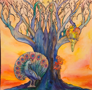
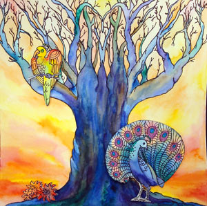
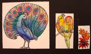
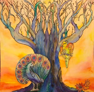
EXAMPLES

final example
final example

STEPS

planning

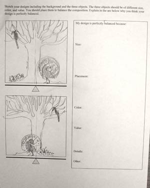
worksheet example

worksheet 1

Use the worksheet to sketch the composition. Write down why you think your design is balanced? Turn it in along with the project. It will be part of your grade.

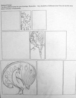
worksheet 2

Use the worksheets to draw the objects. They should fit within the outlines!!!

drawing

symmetrical balamce

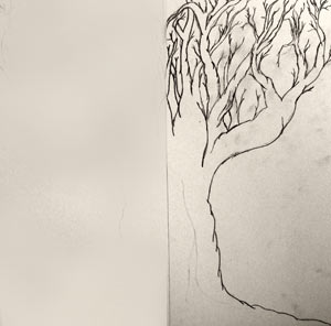
Divide your drawing board in half.

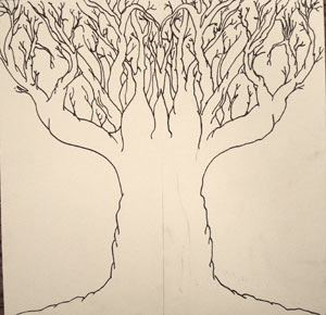
Draw only one side of the design. It should be a detailed drawing.

draw tree

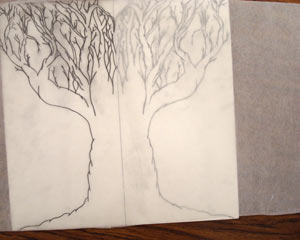
Use tracing paper to trace the design you drew. Make sure you use a pencil!!!

Flip the tracing paper and retrace it onto the other side of the design

details

Now you have your symmetrical design.

Outline it with thin black Sharpie.

coloring

color

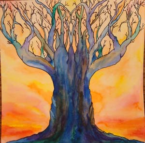
Use colored pencils and watercolor paint to color it.

Now that your background is done – go to the next step.

add ons

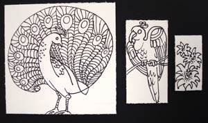
After you sketched the objects – time to redraw them on the board.

Include the details.

colored

Outline everything with a black Sharpie.

Color them with colored pencils and watercolor paint.

putting it together

final example

Cut out the objects.

Place them onto the background.

Reposition them to make a perfect balance.

final example

Glue the details onto the background.

Use foam squares to glue the objects. This way they will be raised above the surface to make the design look three dimensional.

You need to be able to explain me why you think your design is balanced.
Attach the explanation to the back of your project before you turn it in!
...