slides:


by JuliannaKunstler.com
Space refers to the area that a shape or form occupies.
It also refers to the background against which we see the shape or form.
The positive space of a design is the filled space in the design or the shapes that make up the design.
Negative space is the background. The negative space in design is as important as the positive area
Positive space is usually refers to anything that is considered the main focus of the page.
Positive space can be perceived as two dimensional or three dimensional.
Negative space is the white space or empty space which is the part of the design that is not there, the space between the visual elements. This can also be the background color of a design.
Negative space avoids visual clutter and looks clean which can help balance a composition and help focus the viewer on something specific.
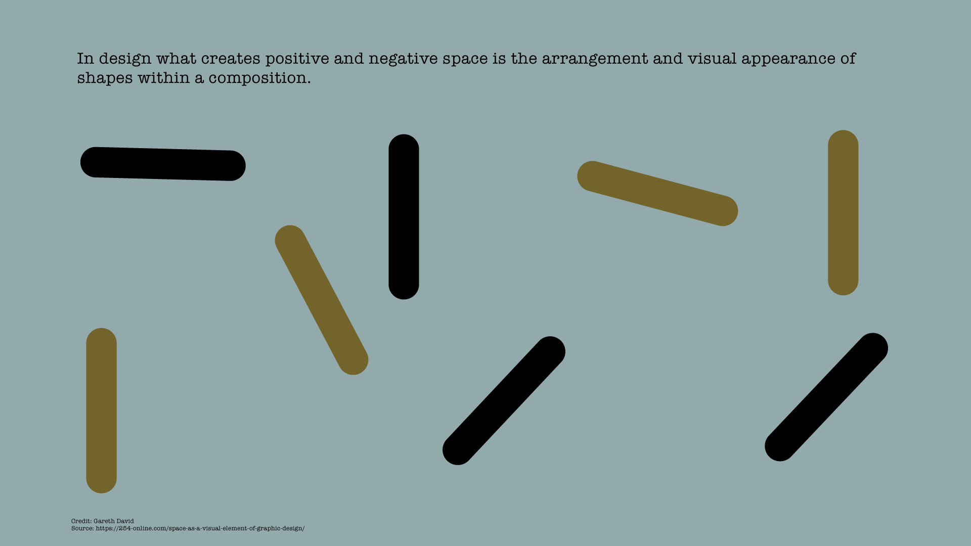
In design what creates positive and negative space is the arrangement and visual appearance of shapes within a composition.
Proximity (space between shapes) suggests relationships between the elements
Overlap is the effect where shapes are arranged to appear to be on top of each other.
This illusion makes the top element look closer to the observer.
Opacity is the effect where objects appear transparent.
Degrees of opacity can make elements look heavy or light to suggest dominance and order of closeness in a space.
Opacity blurs the barriers between positive and negative space.
Overlapping transparent elements can create dynamics in a composition to create an illusion of 3D and perspective.
Light and shadow can give an object a three-dimensional look.
Shadow can create the illusion that an object is on top of another and suggest how far apart they may be.
Depth is created through the arrangement, creation, and manipulation of shapes to look like they appear in real life.
Depth by size.
Depth by placement and size.
Depth by focus.
In design, there is no way to determine the depth of the space, only the order of closeness.
We can also use positive and negative space to create interest, a focal point, balance, set a visual tone and define a look and feel.
The white space in our text is an essential aspect for the viewers to have a smooth reading.
This is what White Space does:
The fewer elements you have on a page, the easier it for your reader to understand what you intended to communicate.
Fewer elements competing for attention results in more white space.
More white space makes it easier to focus on those elements.
Studies concluded that the use of white space between paragraphs and in the left and right margins increased comprehension by almost 20%.
Elements of different visual weight can be balanced asymmetrically by controlling the amount of white space around each element.
White space can be used to indicate a distinction between elements (separate).
A smaller amount of white space can indicate a relationship between elements (grouping).
Variation of white space can be used to help establish visual hierarchy in your design.
Elements and white space work together to create rhythm in your design.
A consistent spacing strategy helps users adapt to the design and understand and anticipate the flow.